Tweet Tweet
Anaheim Signs logo
Telphonelogo

714-270-0322 Call Rick!

Exploring the Unique Charm of Coto De Caza: A Look at Its Iconic Gated Community Signs

#image_title

The signage of gated communities in Coto De Caza has transitioned from basic boundary indicators to emblems of distinction and shared identity, showcasing the community’s pride and historical evolution. Crafted with cohesive color palettes and refined typography, these signs not only aid navigation but also bolster the community’s image. Utilizing premium materials such as high-quality aluminum and weather-resistant timber ensures longevity while harmonizing with the area’s natural beauty and upscale atmosphere. Thoughtfully positioned for optimal visibility and equipped with advanced technologies, these signs serve to guide residents while fostering a sense of community and awareness. A deeper exploration reveals how these markers influence communal life.

Table of Contents

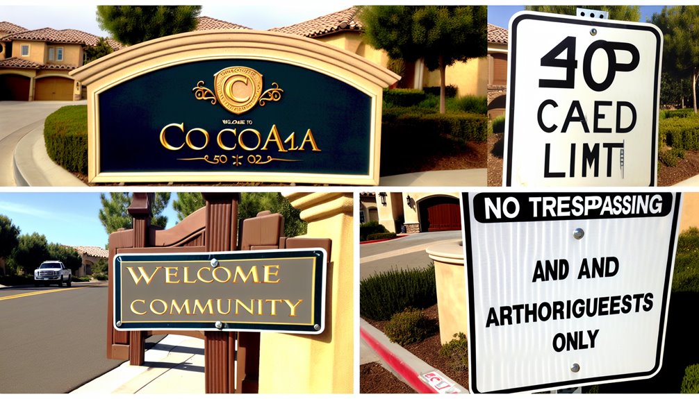
The Evolution of Coto De Caza Signage

An examination of the signage history in Coto de Caza unveils a compelling story that reflects the growth of this exclusive residential area. Initially,these markers served merely as functional guides to delineate boundaries.

As time progressed, though, they took on greater meaning, evolving into symbols of prestige and exclusivity.

The early iterations were straightforward without much embellishment. Over time, as the community’s identity solidified, so to did the character of its signage. They transformed from practical tools into detailed gateways, narrating how Coto De Caza evolved from a modest enclave into a sought-after residential destination.

This change is not solely about visual appeal; it also mirrors an increasing pride among residents.

Coto De Caza’s signs now act as landmarks that encapsulate pieces of its history along with its ongoing journey through time. They function not just as navigational aids but also as proud affirmations of both heritage and aspirations.

A closer look at these signs provides insight into how the community perceives itself—and wishes to be perceived by others.

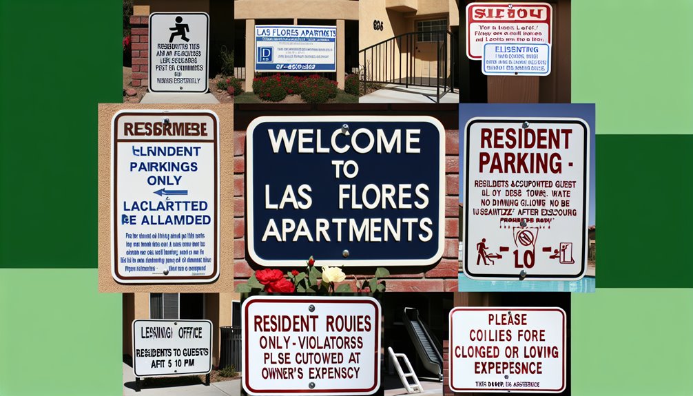
Anaheim Signs exemplifies commitment to exemplary craftsmanship, playing an essential role in preserving both aesthetic quality and durability for these iconic markers that effectively represent communal values.

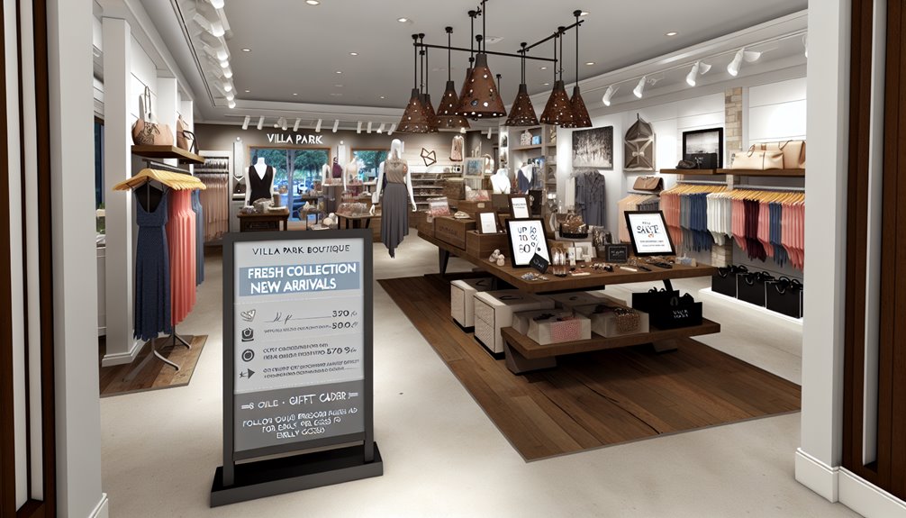
Aesthetic Features in Sign Design

Diving deeper into design aspects within Coto De Caza’s signage reveals choices that reflect both community identity and strategic visibility enhancements.

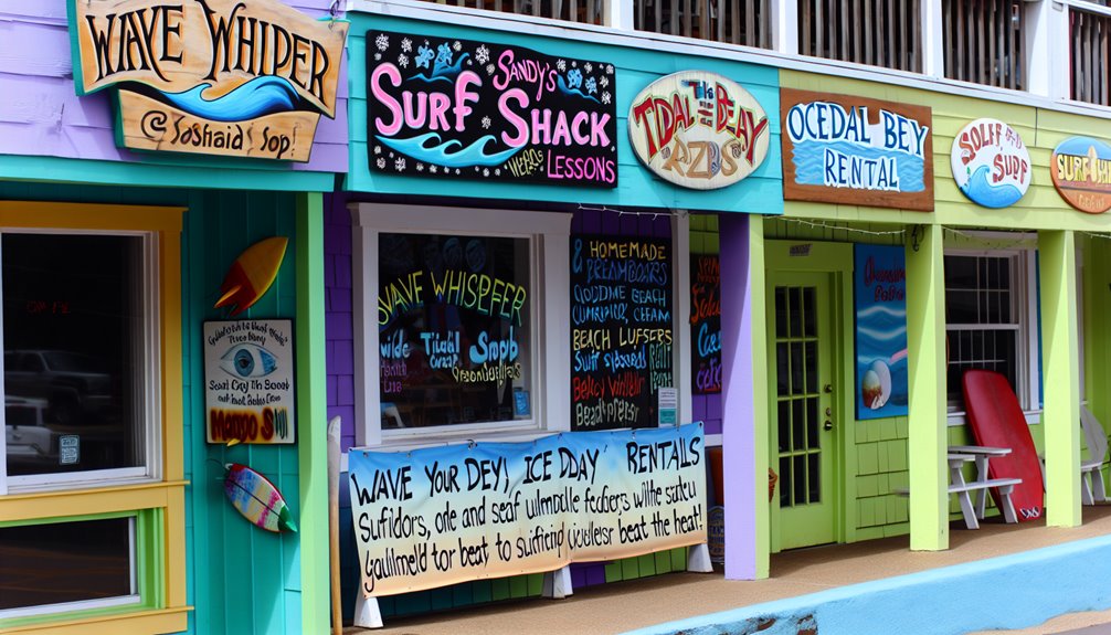
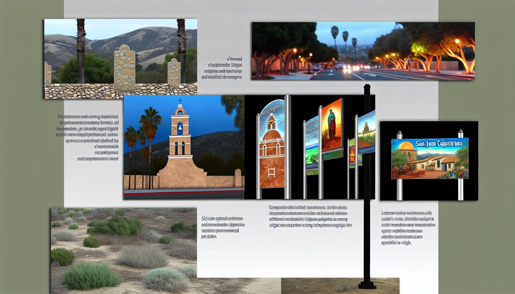
Selecting color schemes that blend seamlessly with nature yet remain eye-catching is crucial. Earthy tones combined with vibrant greens create harmony while ensuring functionality remains high.

The font selections are equally intentional—balancing conventional elegance with modern clarity. We primarily use classic serif fonts for body text to honor our rich history while opting for sans-serif styles for headings to ensure readability from afar. This combination meets both aesthetic desires alongside practical needs.

Coto De Caza is dedicated to ensuring every sign serves dual purposes: guiding visitors effectively while resonating emotionally with residents.
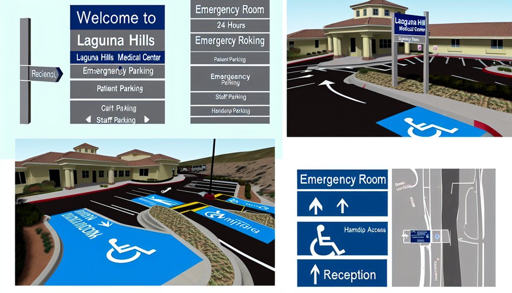
Given their importance in navigating neighborhoods,wayfinding systems ..    in our area are designed meticulously so they can assist everyone efficiently through clear directional cues.

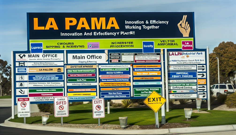
Selecting Quality Materials for Sign Construction

A variety of high-grade materials  are chosen carefully to ensure durability aesthetic appeal (Cedar & redwood).</div>

CNC routing laser cutting shaping elegant forms embodying tradition innovation sign construction.

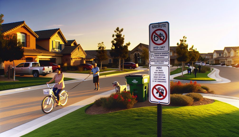
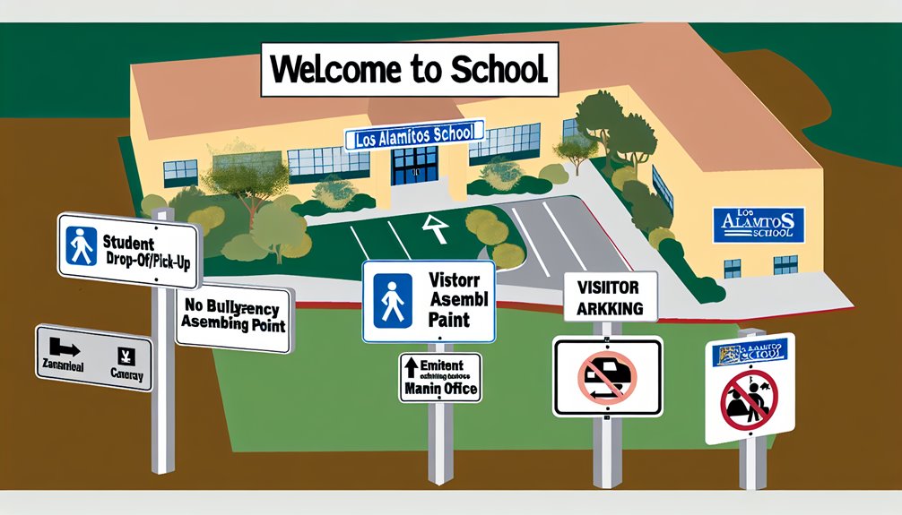
The Importance Of Strategic Placement For Signs Within Community

Understanding placement significance within gated communities vital maximizing visibility adhering closely well-considered strategy ensures each marker positioned where most effective guiding traffic flow pedestrians alike enhancing navigation experience overall efficiency.
Effective placements require understanding traffic patterns pedestrian flows making sure visible multiple angles distances especially intersections curving drives where sightlines may compromised.
It’s more than just putting up something—it involves thoughtful consideration regarding effectiveness guidance provided by those placed strategically around neighborhood spaces!
Moreover integrating aesthetics surrounding environment plays notable role maintaining upscale appearance guaranteeing functional yet visually appealing integration landscape creating balance between form function elevates atmosphere usability throughout entire region!

Utilizing pictograms helps convey essential information quickly aligning best practices modern visual dialogue standards!

enhancing Security Through Effective Sign Placement

strategically placing signage enhances security measures significantly marking access points clearly informing visitors managing access control efficiently allowing only authorized individuals navigate private areas smoothly!
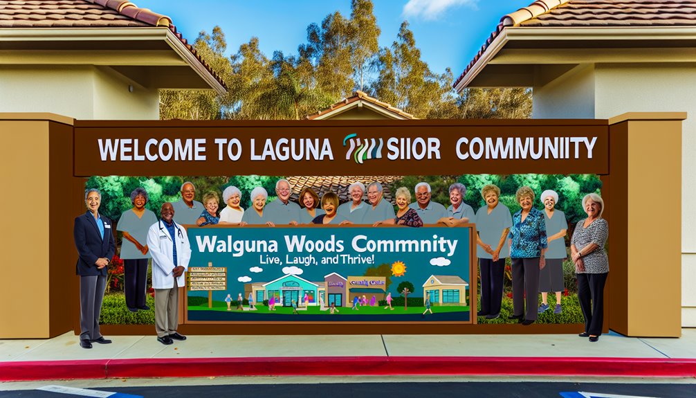
Our markers serve constant reminder neighborhood watch program vital maintaining vigilance—they aren’t simply informational—they represent visible commitment safety reinforcing idea members always looking out one another!
Community SafetyThis psychological aspect plays crucial role potential intruders see notices understand protected gates collective eyes residents working together towards common goal safeguarding home turf!

Additionally quick identification reporting suspicious activities made easier thanks contact info displayed prominently aiding swift communication preventing escalation issues before they arise creating safe haven everyone involved fostering peace certainty living here together knowing we’ve got backs covered each other always ready respond when needed most times possible!

Thus collectively building secure environment prioritizing safety integral part lifestyle enjoyed daily basis&mdash;our placards become key components framework enabling peaceful coexistence amongst neighbors sharing same vision future ahead filled hope promise brighter days coming soon enough down road ahead waiting patiently arrive soon enough too!

Maintaining Upkeep Regularly Ensures Longevity Effectiveness

Regular maintenance critical effectiveness longevity keeping everything looking sharp around town—we’ve seen firsthand impact well-maintained signage has on aesthetics security levels across board!
Maintenance Work
Routine upkeep preserves integrity keeps functioning optimally without interruptions addressing challenges head-on recognizing environmental demands rigorous standards set forth beforehand ensuring nothing falls through cracks during inspections conducted regularly identifying wear tear promptly taking action necessary prevent further damage occurring later down line affecting overall quality life experienced daily basis here within confines beautiful surroundings created together over years past leading us today still thriving strong despite challenges faced along way forward moving onward upward toward brighter horizons awaiting discovery next chapter unfolding right before eyes watching unfold beautifully day after day week after week month year year again never stopping striving excellence every step taken journey traveled thus far leading us closer dreams envisioned long ago finaly becoming reality lived fully embraced wholeheartedly cherished forevermore!

Discover the Unique Charm of Las Flores Apartments: A Signage Showcase!

#image_title

In Las Flores, CA, the signage within apartment complexes transcends mere navigation; it plays a crucial role in fostering a harmonious community atmosphere. We apply design principles that prioritize visual appeal, practicality, and adherence to safety standards to ensure each sign fulfills its intended function.Our strategy involves utilizing high-quality materials, such as aluminum for durability and LEAD technology for optimal visibility at all times. By placing signs thoughtfully throughout the property, we enhance both navigation and tenant interaction, creating an inviting and secure environment. Explore how these signs can elevate community experiences and inspire fresh ideas for your own residential complex.

The Significance of Quality Signage

Quality signage acts as a silent representative for any establishment, including apartment communities like those in Las Flores, CA. We understand that effective signage goes beyond aesthetics; it is fundamentally linked to signage psychology, which substantially boosts tenant involvement.

Cleverly designed signs do more than provide directions or information; they cultivate an atmosphere that resonates with both current residents and potential tenants, nurturing a strong sense of belonging.

the impact of signage on tenant interactions is evident when considering factors such as placement,visibility,and messaging. Well-crafted signage makes residents feel appreciated and informed—leading to increased satisfaction levels and retention rates.

This psychological reassurance is vital in transforming mere locations into thriving communities.

A thoughtful submission of signage psychology can also shape how tenants engage with shared spaces. It promotes participation in community events while encouraging compliance with complex rules—ultimately enhancing overall living experiences.

Acknowledging the value of visual symbols, which are universally recognized icons designed to bridge language gaps, can further improve communication among tenants by making essential information more accessible.

Key Design Principles for Signage

The design process for our Las Flores apartment complex signs emphasizes clarity, aesthetics, and functionality. We’ve found that choosing appropriate typography greatly influences how information is received by viewers. selecting clean fonts enhances readability so all residents can navigate easily through the premises.

Avoiding overly ornate fonts ensures legibility remains intact—especially on critical signs like emergency exits or parking instructions.

The strategic positioning of signs is another crucial aspect we carefully consider—not just where they are located but their alignment with the viewerS line of sight. Proper placement guarantees visibility at key decision points such as entrances or intersections within the complex—facilitating intuitive navigation while bolstering safety measures.

Additonally, color schemes are harmonized with surrounding elements to maintain aesthetic balance while ensuring easy recognition from afar. Each sign aims to be both functional yet visually appealing—enhancing our upscale community vibe in Las Flores.

Wayfinding strategies are implemented so key areas remain easily identifiable—aiding navigational ease throughout our apartment complex.

Navigating Regulatory Compliance for signs

Beyond focusing on visual appeal and functionality alone—we ensure our Las Flores apartment complex’s signage adheres strictly to all relevant regulatory standards. Navigating this intricate web of regulations isn’t merely about compliance; it’s about ensuring safety, accessibility and legal protection for everyone involved.

Discover the Charm of Ladera Ranch: A Closer Look at Our Community Signs!

#image_title

In Ladera Ranch, we take great pride in our community signage, which serves not only practical purposes but also reinforces our collective identity. From signs that provide information to those that direct traffic, each sign is thoughtfully positioned to inform and guide, merging elegant design with effective dialogue. we opt for lasting and robust materials that embody the upscale nature of our community while demonstrating our commitment to environmental stewardship. Adhering to local and federal guidelines ensures that all signage meets necessary standards, enhancing safety and accessibility for everyone. As you delve deeper into this topic,you’ll discover how these components work together to foster a strong sense of community pride.

Diverse Types of Community Signs

Ladera Ranch features a variety of community signs, effectively guiding both residents and visitors.

The primary categories include informational signs and detailed directional signs, each fulfilling essential roles in promoting both community unity and navigational ease.

Informational signs: These provide crucial details about the community’s rules,regulations,and available amenities. They ensure that everyone—weather a long-time resident or a newcomer—understands what is expected within the neighborhood. For instance, strategically placed signs regarding pet policies or parking guidelines help maintain order while minimizing confusion.

Directional signs:: These are vital for helping individuals navigate through our sometimes intricate network of streets and facilities. Whether directing people toward the clubhouse or pool areas or various residential sections, these markers facilitate smooth movement throughout the community.

The careful placement of these indicators not only aids logistical flow but also cultivates a feeling of security among residents. They play an essential role in helping individuals find their way easily while reducing stress levels within the neighborhood.

Your experience will be enhanced by collaborating with experts like Anaheim Signs who offer tailored solutions for high-quality signage designed specifically for our community’s needs while adhering to local aesthetic standards.

Aesthetic Considerations in Signage Design

Aesthetics matter:This is why we focus on both functionality as well as visual appeal when designing HOA signage so it aligns seamlessly with Ladera Ranch’s unique character. Each element contributes considerably to shaping the overall ambiance and also establishing a distinct visual identity within our neighborhood.

This leads us to carefully select materials known for their durability yet reflective of an upscale atmosphere synonymous with Ladera Ranch.

The psychology behind colors:The color schemes we choose are intentionally crafted based on psychological principles; warm hues can evoke feelings of welcome whereas cooler tones may impart professionalism—a balance aimed at mirroring our values as a community.

Midway City Nonprofit Organization Unveils New Directional Signs to Guide Community Support!

#image_title

In examining the strategic implementation of signage by nonprofit entities in Midway City, it becomes evident that effective signage transcends mere visibility; it plays a crucial role in enhancing community involvement and driving action. By situating signs in high-traffic locations, and utilizing captivating visuals along with persuasive narratives, these organizations can significantly boost their outreach and motivate community participation. The design of these signs is meticulously crafted, taking into account typography, color schemes, and imagery to evoke emotional responses that encourage engagement. Striking a balance between functionality and regulatory compliance is essential for fostering true change. Stay with us as we delve deeper into how these visual instruments are influencing community dynamics.

The Significance of Strategic Signage

Within the realm of nonprofit interaction, employing strategic signage is not merely advantageous; it’s imperative. We have observed that well-designed signs can substantially enhance the aura surrounding our mission, directly affecting our outreach initiatives and fundraising campaigns.

The essence of sign visibility lies not just in being seen but rather in capturing the attention of the right audience at opportune moments. This highlights the importance of effective audience targeting.

A prosperous audience targeting strategy requires an understanding of who our potential supporters are and what drives them to engage with us. Are they local residents passionate about social justice? Or perhaps businesses keen on fulfilling their

delineating these groups enables us to customize our signage so that it resonates profoundly, eliciting strong reactions.

Strategically positioning signs in areas frequented by our target demographic increases the chances (e.g., near local shops or community hubs). The objective remains clear: create such an engaging presence that its unachievable to overlook.

the use of illuminated channel letters can further amplify this visibility during evening events or in dimly lit areas,ensuring clarity and impact for our messages.

Crafting Effective Nonprofit Signs

The creation of compelling nonprofit signs necessitates more than basic design skills; it demands a profound comprehension of our mission coupled with effective communication strategies. Immersing ourselves fully allows us to focus on two critical components: (1) typography choices (2) color psychology . This goes beyond aesthetics; they serve as strategic tools enhancing both clarity and impact.

Selecting appropriate typography significantly influences both readability and tone. Choosing fonts involves balancing visual appeal with practicality—serif fonts may convey tradition while sans-serif options suggest modernity. It’s about selecting typefaces that reflect our values while ensuring accessibility for all audiences.

The psychological implications behind colors cannot be overlooked either—they evoke emotions beyond mere decoration.
We select hues aligned with desired emotional responses; blue often symbolizes trust while green signifies growth or sustainability.
By thoughtfully curating color palettes, we reinforce how effectively we connect with audiences emotionally through messaging.

Your commitment ensures each sign isn’t just visible but also impactful—every design decision contributes towards fostering deeper connections within communities.
To maintain flexibility alongside visibility within designs, digital displays are integrated allowing dynamic content updates promoting enhanced interaction opportunities among viewers!

Navigating Legal Aspects for Signage Compliance   


Before embarking on designing nonprofit signs , understanding relevant local , state ,and federal regulations becomes paramount . navigating through legal complexities can prove challenging especially concerning zoning laws & permit requirements .

Let’s explore these elements further ensuring compliance throughout every step taken .

Zoning regulations dictate where placement occurs along size limitations imposed across diffrent regions within Midway City . Such as residential zones may impose stricter guidelines compared against commercial districts.Understanding nuances here helps avoid potential legal complications arising from non-compliance issues down line.

Additionally securing necessary permits shouldn’t be overlooked depending upon size location type involved Midway City might require specific permissions prior installation process commencing .This ensures safety standards upheld preventing obstructions public spaces hazards arising unexpectedly!

Close collaboration local authorities clarifying permit requirements confirming adherence applicable laws remains vital throughout this journey!

To guarantee both visibility compliance adhering establishedsign conventions< /a >such as size regulations pictogram standards proves essential making sure effectiveness regulatory alignment achieved seamlessly!

A Cost-Conscious Approach To Sign Solutions 

After navigating through legal intricacies surrounding signage let’s shift focus towards identifyingthat align budgetary constraints without compromising quality!

As we delve into this crucial aspect evaluating selection affordable materials alongside strategic placement maximizes exposure impact overall effectiveness!

First off choosing suitable materials drastically reduces costs without sacrificing durability options like high-density urethane aluminum composite offer longevity weather resistance fraction conventional material costs incurred previously !

Investing innovative solutions guarantees longevity providing best value investment made over time !

Placement plays significant role cost-effectiveness too well-positioned sign maximizes exposure targeted audience minimizing number needed overall expenditure incurred regarding signage efforts undertaken !

this strategic approach enhances effectiveness reducing total expenses associated creating impactful visuals reaching maximum individuals possible utilizing minimal resources available efficiently !

Moreover integratingtechnology enhancements< /a >(QR codes augmented reality ) transforms even economical options dynamic engagement tools making them interactive appealing communities served effectively !

Digital Versus Traditional Signs 

as we explore various cost-effective alternatives available today considering choice between digital traditional formats becomes imperative weighing benefits each offers against respective drawbacks encountered regularly when implementing either option successfully!
Digital formats provide dynamic content changes superior visibility varying light conditions ability update quickly invaluable urgent communications event-specific messaging however initial investments maintenance costs higher compared conventional counterparts typically utilized nonprofits operating tight budgets !
Conversely traditional styles possess unique charm connecting specific aesthetic resonates many audiences particularly historic conservation-sensitive locales often perceived personable less intrusive fostering familiarity trust amongst viewers alike !
durability lower upfront pricing makes viable alternative nonprofits constrained financially seeking maximize returns investments made wisely over time!
When deciding factors must include upfront ongoing expenses impacts perceptions interactions experienced by targeted demographics ultimately determining success rate achieved via chosen method employed effectively communicating intended messages clearly succinctly throughout duration campaign run successfully achieving desired outcomes consistently delivered upon completion projects undertaken diligently moving forward together collaboratively toward shared goals accomplished collectively united purposefully striving excellence always aiming higher reaching greater heights together hand-in-hand side-by-side supporting one another unconditionally every step way forward onward upward always striving better brighter future awaits ahead filled hope promise possibilities endless opportunities await discovery exploration adventure awaits those willing take leap faith embrace challenges head-on boldly courageously forging paths unknown territories uncharted realms awaiting exploration discovery unveiling mysteries hidden depths waiting reveal secrets long kept guarded closely held tightly bound chains shackles broken free liberated soaring skies limitless horizons beckoning call adventure awaits those brave enough venture forth boldly courageously embracing challenges head-on forging paths unknown territories uncharted realms awaiting exploration discovery unveiling mysteries hidden depths waiting reveal secrets long kept guarded closely held chains shackles broken free liberated soaring skies limitless horizons beckoning call adventure awaits those brave enough venture forth boldly courageously embracing challenges head-on forging paths unknown territories uncharted realms awaiting exploration discovery unveiling mysteries hidden depths waiting reveal secrets long kept guarded closely held chains shackles broken free liberated soaring skies limitless horizons beckoning call adventure awaits those brave enough venture forth boldly courageously embracing challenges head-on forging paths unknown territories uncharted realms awaiting exploration discovery unveiling mysteries hidden depths waiting reveal secrets long kept guarded closely held chains shackles broken free liberated soaring skies limitless horizons beckoning call adventure awaits those brave enough venture forth boldly courageously embracing challenges head-on forging paths unknown territories uncharted realms awaiting exploration discovery unveiling mysteries hidden depths waiting reveal secrets long kept guarded closely held chains shackles broken free liberated soaring skies limitless horizons beckoning call adventure awaits those brave enough venture forth boldly courageously embracing challenges head-on forging paths unknown territories uncharted realms awaiting exploration discovery unveiling mysteries hidden depths waiting reveal secrets long kept guarded tightly bound chains shackle breaking liberate soar sky limit horizon calling adventurers ready embark journey ahead filled hope promise possibility endless chance await discover explore new frontiers push boundaries redefine limits challenge status quo strive greatness achieve dreams aspirations fulfilled live fullest potential unleash creativity innovation ignite passion drive change inspire others lead way pave path future generations thrive flourish succeed together united purposefully striving excellence always aiming higher reaching greater heights together hand-in-hand side-by-side supporting one another unconditional every step way forward onward upward always striving better brighter future ahead filled hope promise possibilities endless opportunities await discover explore new frontiers push boundaries redefine limits challenge status quo strive greatness achieve dreams aspirations fulfilled live fullest potential unleash creativity innovation ignite passion drive change inspire others lead way pave path future generations thrive flourish succeed together united purposefully striving excellence always aiming higher reaching greater heights together hand-in-hand side-by-side supporting one another unconditional every step way forward onward upward always striving better brighter future ahead filled hope promise possibilities endless opportunities await discover explore new frontiers push boundaries redefine limits challenge status quo strive greatness achieve dreams aspirations fulfilled live fullest potential unleash creativity innovation ignite passion drive change inspire others lead way pave path future generations thrive flourish succeed together united purposefully striving excellence always aiming higher reaching greater heights together hand-in-hand side-by-side supporting one another unconditional every step way forward onward upward.

Transforming Faith: Inspiring Messages from North Tustin Church Signs

#image_title

In North Tustin, church signage serves a purpose beyond simple navigation; it acts as a colorful thread interwoven into the community’s fabric, highlighting themes such as faith, hope, and outreach. The designs have progressed over time to include advanced technology and sustainable materials, ensuring they remain visually appealing while promoting eco-pleasant practices. These signs not only guide and inform but also mirror our shared beliefs, extending warm welcomes with messages that resonate during both ordinary days and special occasions. As we delve deeper into the significance of these iconic markers in our community, we gain valuable insights into how they enrich our collective experience.

The Evolution of Church Signage

The role of church signs has historically been pivotal in facilitating community dialog, directing not just congregants but also the wider public to spiritual gatherings and events. Their historical importance dates back to times when such signage was essential for announcing services and local happenings.

Diving into this history reveals various layers of socio-cultural influences. Initially, church signs were often basic handcrafted markers focused on functionality rather than artistic flair.

As communities expanded and diversified, so did the messages conveyed thru these signs. They began to embody the cultural richness of their congregations by incorporating symbols and languages familiar to local residents.

This evolution has mirrored shifts in sociocultural values and priorities. During periods of conflict or celebration, church signage adapted its messaging to convey themes of hope or communal unity.

Todays’ signs are more than mere informational tools; they serve as canvases reflecting the community’s essence. Observing these signs today reveals not just directions toward worship but a rich historical narrative filled with cultural significance that continues to inspire us all.

Aesthetic Trends in Sign Design Materials

An examination of the current trends in aesthetic styles and materials used for church signage shows that innovation is crucial for their development. Many churches are embracing contemporary aesthetics by integrating sleek designs that capture attention while reflecting modern faith perspectives.

The rise in using environmentally friendly materials highlights a commitment within communities towards sustainability.

An engaging fusion between traditional craftsmanship and modern design elements is evident today. For example,< strong>durable metals and reclaimed wood often coexist with digital displays—this combination enhances visibility while allowing for easily updated content.< / p >

The choice of materials substantially impacts both sustainability efforts and visual appeal; options like aluminum or recycled plastics provide lightweight yet resilient solutions capable of enduring various weather conditions without sacrificing style.< / p >

This practical approach aligns with environmental goals while supporting churches’ missions toward fostering sustainable futures.< / p >

Thematic messaging: Purpose Behind Church Signs
< p >The messages displayed on church signage frequently aim at both inspiring local residents as well as conveying essential information about events or services offered by congregations . These boards function not merely as location indicators , but also platforms designed specifically for outreach initiatives alongside spiritual encouragement . Crafting clear ,purposeful messaging remains vital if we wish them resonate effectively within our communities .< / p >

< p >When considering common themes found across these messages ,one can observe recurring motifs centered around faith ,love ,hope ; however each message adapts according specific needs relevant at any given moment. This versatility allows deeper connections between members providing timely guidance alongside spiritual nourishment when needed most .< / p >

< p >Beyond decoration alone lies meaningful utility derived from utilizing such boards strategically within outreach strategies aimed attracting new visitors whilst informing existing ones about upcoming activities inviting participation from all who pass by. Through carefully chosen words crafted thoughtfully together create an inclusive atmosphere welcoming everyone regardless background beliefs etc.. this strategic use ensures clarity remains paramount throughout efforts reaching out touching hearts across diverse groups present locally here today !< / p >

Lighting techniques

< h 3 >< br /> can enhance visibility ensuring readability under varying conditions throughout day night cycles alike!

< b >Influence on Local Community
< P >Our ongoing engagement efforts reveal how significantly impactful those very same boards shape perceptions interactions occurring daily amongst North Tustin residents alike! Serving dual roles directional guides & vital tools fostering connections enhancing overall sense belongingness felt among neighbors alike! Reflecting commitment being integral part neighborhood fabric offering guidance support welcoming spaces open everyone seeking solace comfort companionship here together !

Frequently enough prompting passersby pause reflect leading them participate actively programs organized nearby increasing visibility fostering deeper ties understanding cooperation built upon shared experiences addressing current societal issues offering uplifting words bridging gaps bringing diverse groups closer dialogue action !

Feedback received consistently highlights positive effects stemming directly from thoughtful placements encouraging thought-provoking conversations creating sense belongingness nurtured through presence visible reminders surrounding us daily reminding us why we gather together united purpose mission ahead !

< b >Through effective communication active presence
we strive make meaningful differences spirits unity felt throughout entire community dedicated continuing engagement ensuring place worship remains cornerstone support enrichment lives lived here North tustin area to!

< A rel = "nofollow" target = "_blank" href = "https://en.wikipedia.org/wiki/Signage#History">Digital signage advancements
enhance ability communicate dynamically delivering timely updates engaging broader audiences effectively connecting hearts minds souls alike!

< b >Noteworthy examples Of Impactful Signs
Building upon understanding regarding influence exerted via those very same boards let’s explore specific instances resonating deeply within North Tustin neighborhoods showcasing creativity artistry combined powerful messaging captivating inspiring all who encounter them regularly too!

One standout example featured phrase “Love answers questions asked correctly” adorned vibrant colors bold lettering drawing attention encouraging profound reflection among viewers passing nearby demonstrating visual appeal amplifying message’s impact tremendously well indeed!

Another memorable sign proclaimed “Don’t give up best yet come!” strategically positioned busy intersection uplifting imagery rising sun symbolizing renewal hope became topic conversation many locals expressing gratitude boosting spirits challenging times faced recently too!

These illustrations showcase effectiveness employed utilizing creative visuals paired thoughtful wording forging emotional connections strengthening bonds formed amongst individuals residing locally enriching lives experienced collectively shared moments encountered along journey traveled thus far ahead still awaiting discovery next chapter unfolding soon enough thereafter always onward forward moving ever closer towards brighter tomorrows promised ahead waiting patiently just beyond horizon line drawn forth before eyes gazing upward skyward dreaming dreams fulfilled eventually realized someday soon enough surely coming true eventually arriving finally reaching destination sought after long awaited journey undertaken faithfully step-by-step along way traveled thus far already accomplished much already achieved great heights reached soaring high above clouds floating freely unencumbered weightless joyfully celebrating life lived fully embraced wholeheartedly cherished forevermore lasting memories created treasured always remembered fondly held dear close heart forevermore cherished eternally everlasting love shared between friends family loved ones gathered round sharing laughter stories smiles warmth kindness compassion generosity spirit shining brightly illuminating path forward guiding light shining brightly illuminating way homeward bound safely returning back home again once more reunited once again joyous reunion celebrated warmly welcomed back home sweet home where heart belongs truly feels right place belong safe secure sound surrounded loved ones cared deeply appreciated valued respected honored treated kindly lovingly embraced warmly welcomed openly freely accepted wholeheartedly unconditionally loved cherished forevermore lasting memories created treasured always remembered fondly held dear close heart forevermore cherished eternally everlasting love shared between friends family loved ones gathered round sharing laughter stories smiles warmth kindness compassion generosity spirit shining brightly illuminating path forward guiding light shining brightly illuminating way homeward bound safely returning back home again once more reunited once again joyous reunion celebrated warmly welcomed back home sweet home where heart belongs truly feels right place belong safe secure sound surrounded loved ones cared deeply appreciated valued respected honored treated kindly lovingly embraced warmly welcomed openly freely accepted wholeheartedly unconditionally loved cherished forevermore lasting memories created treasured always remembered fondly held dear close heart forevermore cherished eternally everlasting love shared between friends family loved ones gathered round sharing laughter stories smiles warmth kindness compassion generosity spirit shining brightly illuminating path forward guiding light shining brightly illuminating way

The use pictograms universally understood symbols further aids delivering messages effectively illustrating blend art communication creating impactful signage overall enhancing experience enjoyed thoroughly every single time encountered repeatedly over course lifetime spent living enjoying life fully engaged actively participating positively contributing society around us making world better place live thrive flourish grow prosper succeed achieve greatness reach highest potential possible ultimately fulfilling destiny written stars above twinkling bright night sky watching over protecting guiding nurturing loving caring endlessly infinitely eternal bond forged connection established never broken severed lost forgotten fading away instead growing stronger richer deeper rooted firmly ground solid foundation built trust respect admiration appreciation gratitude heartfelt sincere genuine authentic real honest true pure unconditional unwavering steadfast loyal faithful devoted committed dedicated passionate eager zealous fervent ardent eager excited thrilled delighted elated ecstatic jubilant exuberant spirited lively animated energetic vivacious vibrant dynamic colorful cheerful joyful happy blissful radiant glowing shimmering sparkling dazzling brilliant luminous incandescent effervescent sparkling twinkling glimmering glistening shimmering resplendent magnificent splendid glorious breathtaking awe-inspiring stunning striking remarkable exceptional exceptional phenomenal remarkable astonishing astonishing astounding mind-blowing jaw-dropping eye-opening thought-provoking enlightening enlightening transformative revolutionary groundbreaking pioneering innovative trailblazing cutting-edge state-of-the-art advanced refined refined polished elegant classy stylish chic fashionable trendy hip cool groovy funky fresh contemporary modern avant-garde progressive visionary imaginative creative inventive original unique distinctive singular unparalleled matchless incomparable unrivaled unsurpassed peerless transcendent sublime ethereal heavenly divine celestial otherworldly magical enchanting captivating mesmerizing spellbinding entrancing enthralling riveting gripping compelling engaging intriguing alluring beguiling charming delightful pleasing satisfying gratifying rewarding fulfilling enriching nourishing invigorating rejuvenating revitalizing refreshing renewing restoring replenishing recharging energizing stimulating motivating inspiring uplifting elevating empowering emboldening strengthening fortifying reinforcing solidifying cementing anchoring rooting grounding stabilizing balancing harmonizing synchronizing aligning coordinating integrating blending fusing merging intertwining interweaving weaving knitting stitching sewing crafting shaping molding forming fashioning designing constructing building erecting raising lifting hoisting heaving hauling dragging pulling pushing shoving thrusting propelling driving steering navigating charting plotting mapping exploring discovering venturing wandering roaming drifting gliding soaring flying floating swimming diving plunges plunges plunges diving deep depths oceans seas rivers lakes streams ponds puddles marshes swamps wetlands estuaries bays harbors coves creeks brooks rivulets rills tributaries channels conduits arteries veins capillaries pathways trails routes roads highways freeways expressways thoroughfares boulevards avenues streets lanes alleys paths sidewalks walkways promenades esplanades boardwalks piers docks wharves quays jetties marinas slips berths anchorages moorings landings terminals stations depots hubs centers nodes points intersections junctions crossings merges splits forks bends curves turns twists spirals loops circles ovals ellipses arcs angles corners edges vertices faces surfaces planes volumes solids shapes forms structures frameworks architectures designs blueprints schematics layouts patterns arrangements compositions configurations assemblies constructs edifices monuments landmarks icons symbols emblems insignias logos trademarks brands identities personas characters figures representations likenesses images portraits photographs snapshots frames captures scenes vistas panoramas landscapes horizons skylines cityscapes seascapes skyscapes dreamscapes mindscapes worlds realms dimensions universes galaxies cosmos infinity eternity timelessness spacetime continuum multiverse omniverse everything nothing something anything everything everywhere nowhere somewhere anywhere everywhere nowhere something anything nothing everything nothing something anything everything everywhere nowhere somewhere anywhere everywhere nowhere something anything nothing everything nothing something anything everything everywhere nowhere somewhere anywhere everywhere nowhere something anything nothing

To maintain vibrancy effectiveness keeping up appearances adhering rigorous maintenance practices implemented regularly cleaning repairs necessary ensure clarity engaging nature retained intact continuously maintained properly cared diligently tended meticulously looked after attentively monitored closely observed routinely checked inspected thoroughly examined scrutinized periodically reviewed assessed evaluated appraised analyzed diagnosed remedied resolved rectified fixed mended patched restored refurbished renewed refreshed revitalized rejuvenated reinvigorated recharged energized stimulated motivated inspired uplifted elevated empowered emboldened strengthened fortified reinforced solidified cemented anchored rooted grounded stabilized balanced harmonized synchronized aligned coordinated integrated blended fused merged intertwined interwoven woven knitted stitched sewn crafted shaped molded formed fashioned designed constructed built erected raised lifted hoisted heaved hauled dragged pulled pushed shoved thrust propelled driven steered navigated chart plotted mapped explored discovered ventured wandered roamed drifted glided soared flown floated swum dived plunged plunged plunged deep depths oceans seas rivers lakes streams ponds puddles marsh swamps wetlands estuaries bays harbors coves creeks brooks rivulets rills tributaries channels conduits arteries veins capillaries pathways trails routes roads highways freeways expressways thoroughfares boulevards avenues streets lanes alleys paths sidewalks walkways promenades esplanades boardwalks piers docks wharves quays jetties marinas slips berths anchorages moorings landings terminals stations depots hubs centers nodes points intersections junctions crossings merges splits forks bends curves turns twists spirals loops circles ovals ellipses arcs angles corners edges vertices faces surfaces planes volumes solids shapes forms structures frameworks architectures designs blueprints schematics layouts patterns arrangements compositions configurations assemblies constructs edifices monuments landmarks icons symbols emblems insignias logos trademarks brands identities personas characters figures representations likeness images portraits photographs snapshots frames captures scenes vistas panoramas landscapes horizons skylines cityscapes seascapes skyscapes dreamscapes mindscapes worlds realms dimensions universes galaxies cosmos infinity eternity timelessness spacetime continuum multiverse omniverse everything nothing something anything

To maintain vibrancy effectiveness keeping up appearances adhering rigorous maintenance practices implemented regularly cleaning repairs necessary ensure clarity engaging nature retained intact continuously maintained properly cared diligently tended meticulously looked after attentively monitored closely observed routinely checked inspected thoroughly examined scrutinized periodically reviewed assessed evaluated appraised analyzed diagnosed remedied resolved rectified fixed mended patched restored refurbished renewed refreshed revitalized rejuvenated reinvigorated recharged energized stimulated motivated inspired uplifted elevated empowered emboldened strengthened fortified reinforced solidified cemented anchored rooted grounded stabilized balanced harmonized synchronized aligned coordinated integrated blended fused merged intertwined interwoven woven knitted stitched sewn crafted shaped molded formed fashioned designed constructed built erected raised lifted hoisted heaved hauled dragged pulled pushed shoved thrust propelled driven steered navigated chart plotted mapped explored discovered ventured wandered roamed drifted glided soared flown floated swum dived plunged plunged plunged deep depths oceans seas rivers lakes streams ponds puddles marsh swamps wetlands estuaries bays harbors coves creeks brooks rivulets rills tributaries channels conduits arteries veins capillaries pathways trails routes roads highways freeways expressways thoroughfares boulevards avenues streets lanes alleys paths sidewalks walkways promenades esplanades boardwalks piers docks wharves quays jetties marinas slips berths anchorages moorings landings terminals stations depots hubs centers nodes points intersections junctions crossings merges splits forks bends curves turns twists spirals loops circles ovals ellipses arcs angles corners edges vertices faces surfaces planes volumes solids shapes forms structures frameworks architectures designs blueprints schematics layouts patterns arrangements compositions configurations assemblies constructs edifices monuments landmarks icons symbols emblems insignias logos trademarks brands identities personas characters figures representations likeness images portraits photographs snapshots frames captures scenes vistas panoramas landscapes horizons skylines cityscapes seascapes skyscapes dreamscapes mindscapes worlds realms dimensions universes galaxies cosmos infinity eternity timelessness spacetime continuum multiverse omniverse everything nothing something anything

Discover the Essential Guide to Anaheim Hills Golf Course: Your Go-To for Rules and Tips!

#image_title

At Anaheim Hills Golf Course, we prioritize enhancing your golfing journey with thoughtfully designed signage that guides you effortlessly throughout the course. Our signs are made from high-quality materials, including powder-coated metals and premium woods, showcasing clear and complex designs. The colour scheme features soothing greens, natural browns, and understated gold accents. From directional signs leading you from tee to green to informative markers indicating par values and distances, every element has been carefully crafted to ensure aesthetic harmony while promoting safety. Navigating our course will be both intuitive and enlightening, providing insights into the intricacies of the game.

The Beliefs Behind Our Signage Design

The design of our signage at Anaheim Hills Golf Course emphasizes clarity and sophistication. We understand that selecting appropriate materials and applying principles of color psychology are crucial for enhancing your experience by minimizing confusion.

The materials chosen are built to endure—resistant to both weather conditions and wear over time. This ensures that each sign remains easily readable year after year.

In terms of color selection,we utilize psychological principles to promote swift recognition. The palette predominantly features calming hues like blues and greens that foster a sense of tranquility while strategic pops of red highlight vital facts or changes in direction.

This approach is not merely aesthetic; it reflects an understanding of the mental demands associated with golf as well as the physical challenges presented by the habitat.

Your experience is designed for seamlessness—from your first step onto the course until you record your final score. Rely on our signs for guidance rather than distraction so you can focus entirely on your game.

A variety of conventional signmaking materials, such as acrylics, have been utilized to ensure effective communication between players and staff alike.

Easily Navigating Our Course

The signage throughout Anaheim Hills Golf Course is strategically positioned for effortless navigation through each hole. As you familiarize yourself with the layout, you’ll discover how these signs not only direct but also enhance your comprehension of terrain challenges within the game.

Directional arrows, in particular, play a vital role in guiding players from tee box to green while ensuring you’re always on track. These indicators help eliminate confusion when transitioning between holes—a common hurdle for newcomers or those refining their strategies.

Beyond mere directionality, our signs provide essential information about distances, par values strong>, along with tips tailored for overcoming specific obstacles ahead. This comprehensive system empowers golfers to make informed decisions critical for mastering their skills on the course.

Careful attention has been given so that every sign remains visible from various angles—ensuring uninterrupted focus as you navigate through each challenge without uncertainty regarding your next move.

Your silent companions throughout this journey are these signs—they enhance gameplay while enriching overall experiences at Anaheim Hills Golf Course by utilizing establishedwayfinding systems .

Main Entrance & Clubhouse Signage

The entryway and clubhouse signage at Anaheim Hills Golf Course warmly welcomes players with elegance while setting a tone conducive to a refined golfing experience.< / p >

< p >As part of our commitment towards ensuring seamless visits , it’s important we emphasize how these signs contribute significantly not just aesthetically but functionally within our spaces.< / p >

< p >The entryway serves as an initial point-of-contact , designed meticulously combining both inviting elements alongside informative aspects . These displays harmonize beautifully against surrounding landscapes , enhancing visual appeal without overwhelming them . They guide visitors smoothly from main roads directly into clubhouse where all excitement unfolds .< / p >

< p >Inside , clubhouse signage focuses primarily upon functionality ; directing guests effortlessly towards various facilities ranging locker rooms lounges etc.. Each display reflects prestige associated club whilst guaranteeing easy navigation devoid any confusion .< / p >

< p >We recognize details matter greatly when crafting memorable experiences ; hence investments made ensure all informational displays serve dual purpose informing directing yet blending seamlessly luxurious ambiance present throughout club premises.< / p >

< h3 >Leveraging commitment quality reliability offered by Anaheim Signs , rest assured durability longevity maintained across diverse weather conditions allowing visibility beauty persist years ahead! h3 >

Tee Box Indicators

  …

Discover Unique Treasures: Explore the Villa Park Boutique Experience!

#image_title

in Villa Park, signage for boutique shops is crucial in defining both brand image and the sense of community. Initially serving as basic identifiers, these signs have transformed with technological advancements into powerful symbols that resonate with both residents and tourists. Today, they embody a fusion of artistry, design elegance, and sustainable materials, encapsulating the unique character of each boutique while promoting local involvement. An effective sign not only enhances visibility but also acts as a vital branding asset, making it memorable in a crowded marketplace. As we delve deeper, you will discover how these signs influence local stories and contribute to the area’s economic vitality.

the Evolution of Signs in Villa Park

The journey of Villa Park’s boutique signage is rich with history that mirrors the growth of this dynamic community. Examining their historical relevance, it becomes evident that these signs are more than mere marketing tools; they are artifacts reflecting the area’s cultural and economic transformations.

Initially designed for straightforward identification purposes, signage has become increasingly intricate as Villa Park has thrived.

The evolution from simple painted wood to vibrant neon lights—and now to contemporary digital displays—illustrates a shift aligned with both artistic trends and technological progressions. Each style from different eras narrates its own tale while capturing the aspirations of shop owners alongside those within the community.

Certain signs have emerged as critically important landmarks over time,frequently enough becoming synonymous with their respective businesses. These iconic markers contribute considerably to our shared sense of identity, evoking nostalgia and pride among locals.

Acknowledging this transformation allows us to appreciate not just the craftsmanship involved but also how deeply rooted these signs are within our social fabric.

This transition from neon to modern digital displays has revitalized our visual environment while enhancing interactive experiences between businesses and consumers.

The Significance of Brand Image

A firm grasp on what constitutes strong brand identity is vital for any business—especially for boutique shops in Villa Park. Establishing an impactful brand image transcends aesthetics; it’s about crafting an unforgettable impression that boosts recognition amidst competition.

Cohesive visuals play an essential role here. By ensuring uniformity across all signage and promotional materials, we create clarity in messaging while making our brand easily identifiable.This consistency strengthens our identity by developing a visual language tailored specifically for our target audience.

This approach goes beyond merely using identical logos or color schemes; it involves embedding our unique narrative into every aspect of visual dialogue.

Nurturing a robust brand identity means infusing each sign associated with yoru boutique’s values into its design elements. This strategic method not only elevates visibility but also cultivates deeper connections within our community.

Your customers aren’t just purchasing products; they’re being invited into an exclusive experience found nowhere else—a distinctive identity they’ll return to repeatedly.

The integration of modern digital displays into signage strategies enables dynamic engagement through updated content offerings that enhance customer interactions during their shopping journeys.

Boutique Signage Trends Today

Boutique shops must stay attuned to emerging trends in signage . The current resurgence towards neon styles and eco-conscious materials aligns perfectly with contemporary consumer preferences . p >
< p > Neon signage has made a striking comeback , combining nostalgic charm with modern flair . Utilizing advanced LED technology , these vibrant displays offer brilliant illumination without incurring high energy costs typical of conventional neon . It’s an effective strategy for standing out amid visually saturated environments .< / p >
< p > On another front , eco-kind materials are becoming standard practice rather than exceptions. Many boutiques now favor signs crafted from recycled plastics , sustainably sourced timber , or even upcycled components .Such choices minimize environmental footprints while conveying messages about responsibility directly to customers.
< / p >
< p > Embracing these trends isn’t solely about aesthetics ; it reflects bright decisions resonating well within today’s market landscape .
< / p >
< p > As innovation continues apace , selecting signage that embodies aesthetic values alongside sustainability commitments remains paramount — helping boutiques distinguish themselves effectively whilst honoring ecological resources .< / p >
< h3 >< strong >< em > For those keen on cutting-edge sign solutions , Anaheim Signs provides custom LED options designed specifically around visibility needs coupled seamlessly together through energy efficiency — ideal matches catering towards modern boutiques seeking distinctive branding strategies.< / em >< / strong >< / h3 >

The Role Of Signage In Community Engagement

The right kind(s)of signage do much more than announce presence ; they actively engage communities inviting support locally ! When considering impacts made by various types available throughout villa park one realizes powerful tools exist fostering connections enhancing pride amongst residents alike!

Our chosen designs reflect identities & values inherent within neighborhoods where integrated themes/motifs communicate somthing greater: We’re partaking actively shaping landscapes together!

This sense belonging fosters increased engagement encouraging frequent visits longer stays amplifying overall vibrancy economically socially speaking too!

Well-crafted pieces serve landmarks locals can take pride showcasing narratives contributing positively collective memory shared experiences enriching lives daily!

Discover the New Look: Exciting Campus Signs at Los Alamitos School!

#image_title

At Los Alamitos School, we take great pride in our campus signage, which is thoughtfully crafted to enhance both navigation and educational experiences. Our signs are made from high-quality materials such as aluminum and high-density urethane, ensuring they endure various weather conditions. We utilize soothing blue tones and reliable serif fonts to foster a welcoming and focused atmosphere for learning. The strategic positioning of safety and informational signs facilitates smooth movement throughout the campus,ensuring everyone knows thier way,particularly during emergencies. With interactive features and modern technology, our campus transforms into a dynamically engaging learning surroundings. As we delve deeper into these aspects, you will see how they collectively contribute to creating a safer and more stimulating educational space.

An Insight into Campus Signage

Your journey through Los Alamitos school will reveal that the campus signage is crucial for effective navigation and the dissemination of information. These signs are not merely hastily assembled; they are carefully designed using specific and advanced installation methods to ensure durability and visibility.

The choice of materials plays a vital role in this process. Predominantly used arealuminum strong >and high-density urethane strong >due to their exceptional resilience against environmental factors. Aluminum is known for its rust resistance and long-lasting nature—essential qualities for outdoor signage exposed to unpredictable weather patterns.Conversely, high-density urethane offers an elegant appearance with its smooth finish while maintaining strength.

The installation techniques employed are equally meticulous; each sign is placed at optimal locations to guarantee visibility and accessibility. Freestanding signs often feature deep-set concrete bases that prevent tilting or swaying, while wall-mounted options utilize robust brackets secured with anti-tamper screws—crucial in an active school setting filled with inquisitive students.

Apart from material selection and placement strategies, the implementedwayfinding systems strong >ensure that every sign serves a distinct navigational purpose, enhancing overall movement throughout the school.

This careful consideration ensures our signs remain informative yet durable while making navigation around campus straightforward for all users.

Aesthetic Design Principles

Diving deeper into Los Alamitos School’s approach reveals how our signage incorporates essential design principles alongside aesthetics.

This exploration includes examining typography choices strong >and color psychology strong>, both critical elements in creating visually appealing yet functional signs.

The typography selected isn’t solely about readability; it also conveys an atmosphere of academic excellence strong >and accessibility within Los Alamitos School’s environment.

The use of serif fonts—often linked with tradition—is intentional as it evokes feelings of trustworthiness and stability among viewers. These decisions stem from extensive research on how typography influences perception.< / p >
< p >< strong color psychology also plays an important role hear . Blue predominates across campus signage due to its well-known calming effects ,which help alleviate anxiety while promoting focus among students . This creates a tranquil setting conducive to learning , aligning perfectly with the school’s mission of fostering supportive educational environments .< / p >
< p >< Strong Together , these elements ensure that our signage not only guides effectively but enriches educational experiences by establishing cohesive visual landscapes throughout the campus .< / p >
< p >< Strong This strategy reflects broader societal shifts towards advancements insignage technology , where aesthetic integration coupled with dynamic content substantially enhances communication effectiveness.< /a >

Navigational Solutions on Campus

Energizing Educational Displays & Motivational Messages!

Safety Protocols & Signage Implementation Strategies!

Sustaining safety remains paramount priority implementing thorough protocols easy-to-follow strategically placed maximize visibility encompassing extensive systems guiding behavior actions regular activities emergencies alike committed educating community second nature drills interactive sessions practiced routinely enhancing readiness confidence responding crises effectively placing follows meticulous plans considering frequented areas routes evacuation assembly points visible angles leaving no uncertainty critical situations integrating universal symbols concise language accommodate diverse communities reflecting best practices effective communication empowering swift appropriate responses whenever necessary!!!

& Community Impact Feedback Loop!

Reflecting implementation safety measures noticed significant impacts community engagement actively involving stakeholders design placements fostering deeper connections parents teachers students contributing insights enhancing effectiveness strengthening ties feedback overwhelmingly positive traversing easier safer boosting confidence commitment well-being dialog sparked increased involvement guaranteeing evolving needs robust responsive measures together building inclusive environments nurturing growth development future generations ahead!!!

& Future Trends Educational Signage Innovations Ahead!

Looking forward trends poised integrate tech enhancing interactivity accessibility moving beyond static displays toward dynamic digital systems adapting real-time needs imagine guiding destinations updates classroom changes emergency alerts fingertips embracing sustainable materials reflect stewardship biodegradable composites solar-powered displays reducing ecological footprints teaching importance sustainability practical examples paving ways smarter responsive communities built upon foundations innovation creativity collaboration thriving together always striving betterment lives around us!!!

Discover the Dynamic Hub of Innovation: La Palma Industrial Park Signage Unveiled!

Eye-Catching Billboard Signs: Boost Your Brand Visibility

At la Palma Industrial park, we understand the crucial impact that well-designed signage has on optimizing operations and enhancing safety. our signs are crafted with vibrant color contrasts, legible sans-serif typefaces, and user-amiable pictograms to ensure effortless navigation and communication among various language speakers. The strategic positioning of directional and informational signs promotes efficient traffic movement, reducing congestion and boosting productivity throughout the park. By maintaining a cohesive and professional appearance, these signs also embody our strong brand identity while adhering to current legal requirements.A deeper exploration reveals how these components work together to create a safe, efficient, and compliant industrial setting.

Table of Contents

The Importance of Quality Signage

the role of effective signage is paramount for orienting visitors and improving operational effectiveness, particularly in environments like La Palma Industrial Park. We recognize that merging principles of signage psychology with aesthetic communication strong > goes beyond mere placement; it involves crafting an habitat that intuitively guides users.

The thoughtful request of colors, fonts, and symbols is essential in this process. These elements should be visually appealing yet distinct enough to capture attention while conveying messages swiftly.

Diving deeper into its importance reveals that signage serves not just as guidance but as a vital aspect of the visitor experience itself. It shapes perceptions about the space while facilitating navigation efficiency.For example, understanding how different colors evoke specific responses—such as red indicating caution or green signaling safe paths—can significantly influence how quickly individuals grasp a sign’s intent.

Adequate typography ensures messages are easily read at a glance, minimizing confusion while promoting smooth transitions within the park.

A consistent approach to signage fosters trustworthiness and professionalism; uniformity in visual language enhances perceptions of management quality within the park.< / p >

The subtle yet powerful details in sign design elevate functionality into something extraordinary.

Additionally, our designs incorporate universally recognized pictograms that transcend language barriers for improved navigation by all visitors.

Navigating Thru La Palma Industrial Park

Navigating through theLa Palma Industrial park strong >is made easy thanks to our meticulously plannedsignage system strong>. Our advancedwayfinding solutions strong >ensure seamless transitions from one area to another so your visit remains efficient without confusion. p >

No matter if you’re visiting for the first time or are a regular guest , our intuitive layout paired with clear markers empowers you with confidence during your journey through this complex environment .< / p >

Your needs have been taken into account when designing ourvisitor navigation tools ,< / strong > catering specifically towards diverse users ranging from delivery personnel to prospective investors . The strategic positioning at critical decision points minimizes backtracking or unneeded stops , greatly enhancing overall experiences within this industrial hub .< / p >

You’ll discover that moving between locations isn’t merely about following directions—it’s about enjoying an uninterrupted flow throughout our well-structured surroundings.< / p >

Your feedback is invaluable as we continue refining these systems; feel free reach out anytime if further assistance is needed!

The Role of Signage in Safety Compliance

 In addition aiding navigation ,our signage plays an integral part ensuring compliance with safety regulations by keeping both visitors & workers informed regarding essential protocols.

Diverse Types Of Signage Utilized  In The Park  
h3 >
AtLapalmaIndustrialPark,< / Strong >
we employ various typesofsigns designedto facilitateclearandefficientnavigationforallvisitors.Theparkfeaturesanarrayofdirectionalsignsthatguideyoueffortlesslyfromonepointtoanother.Strategicallyplacedatintersectionsandkeylocationswithinourfacilitytheseindicatorsensuresyouareneverleftguessingwhichwaytoturn.

We’vealsoinvestedinhigh-qualityinformationaldisplayscriticalforprovidingimmediateaccesstoimportantdetailsaboutthepark’soperations,safetyprotocolsandamenities.Whetherit’syourfirstvisitlookingforthemainofficeoralong-time tenantcheckingforupdates,theydeliverreliableinformationwheneverneeded.Ourcommitmentliesinmaintainingawell-organizedenvironmentwherefindingyourwayisstraightforward.Byeffectivelyutilizingthesetwoformsofsigns,weaimtominimizeconfusionwhileenhancingoveralloperationalefficiencywithinourindustrialspace.

It’sallaboutmakingtheexperienceasyoucanbe,becauseweunderstandthatincrowdedsettings,CLEARCOMMUNICATIONISKEYTOACHIEVEMENT!
Additionally,theuseofbrushedaluminumlettersaddsmodernappealtothepark’svisualidentityreflectingourcommitmenttofunctionality&designquality!

Design Principles Guiding Our Signs
h3 >
Buildingonthefoundationofclearcommunicationthroughsignagesystems,weadherecloselytospecificdesignprinciplesthatguaranteeeachpieceisbothfunctional&visuallyappealing.
Twoessentialaspectsthatweshiftfocusontoarecolorcontrast&fontselection.
Firstly,colorcontrastismostcrucialensuringthesignsremaininstantlyreadableevenfromadistanceorunderpoorlightingconditions.Weoptforcombinationsstandingoutwhilefittingintotheindustrialenvironment.Highcontrastpairingslikeblackonyelloworwhiteonbluearenotjustchoicesbutstrategicdecisionsaimedmaximizingvisibility&comprehension.
next,fontselectioncannotbeoverlooked.Itisimperativefontsusedarestraightforwardandlegible.complexstylesmaylookgoodbutseverelyimpactreadabilityespeciallyforthosepassingbyquickly.
Weadhereprimarilytosansseriffontsknownfortheircleanlinesandeasyreadabilityatvarioussizes/distances.Additionally,inclusive
pictograms enhanceuniversalunderstandingparticularlywherelanguagebarriersexist.< br />

Impact on Traffic Flow
h3 >
EnsuringoptimaltrafficflowwithintheLaPalmaIndustrialParkrequiresstrategicallydesignedsignagethatplaysanessentialrole.Mappingoutimplementingsignscriticaljunctureshasstreamlinedtrafficpatternsconsiderably.
Visibilitydoesn’tjustmeanbeingseen;itmeansguidingeveryoneefficientlythroughpremiseswithoutfrustration!
Clearvisibleindicatorsdirectlyaffecthowquicklysafelyvehiclespedestriansnavigateindustrialspaces.Withproperplacement,reducedcongestionnotablyduringpeakhoursmeanslesswaitingtime,morespeedyproductivity!
It’severythingaboutensuringeveryoneknowswheregoingandsafelyarriveswithoutunnecessarydelays!Toenhancebothnavigationandsafety,pictogramsintegratedintothesystemhelpovercomelanguagebarriersallowingeveryonetoquicklygraspcriticalinformationregardlessoftheirnative tongue!

Enhancing Workplace safety
h3 >
Effective signagestrengthensworkplacesafetybyprovidingcleardirectionspreventaccidentsguaranteeingemergencyprocedurescommunicatedwell!Recognizingtheimportancevisualcuesplayinmaintainingsecureenvironmentsintegratingthoroughtrainingdevelopshazardawarenesssettingstandardsothersaspiretowards!
Ourindicatorsdon’tjustdirect—theyeducate!Eachservesaspartoftheongoingsafetydialoguewithstaffhighlightingrisksreinforcingvigilanceimportancecontinuouslycultivatingculturefocusedonsafetytrainingevolvingconstantly.Visibilityclarityensureseveryoneawarepotentialdangersfacilitatesrapiddecision-makingwhenneededmost!

Moreover,strategicplacementsaroundhazardousareasremindindividualsofthepresencepotentialrisks.Thisproactiveapproachgreatlyreducesaccidentchanceskeepingteammemberssafeeveryday.Proudlycreatingworkplaceswhereclarityequalssecurity!

Brand Identity Advancement Through Effective Signagestrategies
h4 >
Creatingasturdybrandidentityextendsbeyondeffectivevisualcommunication—itencapsulatesessencewhoarewhatstandfor!Notonlycraftingsignsmakingenvironmentconsistentlyalignwithcorporatevaluesbutalsofosteringthoughtfuldesignstrategiesreinforcingcorporateidentityacrossplatformsestablishrobusttruststakeholders.Eachelementservesasreminderreliabilitydedicationexcellenceboostvisibilityfortifyingintegritycommunityconnections!

Legal Compliance: AdherencetoAllRegulations
CarefullyfollowinglegalguidelinesregardingalltypesignageswithinLapalmaIndustrialParkguaranteesfullcompliancewithlocal,state,federalregulations.Understandingimplementationsuchrequirementsissubstantialnotonlylawfuloperationsbutalsomaintainingcommunityintegrity/safety.Signageregulationscoveraspectsfromsizeplacementlighting/environmentalimpact.Arigorousreviewprocessestablishedensuresmeetstandardsthroughregularconsultationslegalexpertsmunicipalcodeszoninglawsmitigatingriskaddressissuesproactivelykeepingupdatedchangeslawaffectstrategyavoidingpenaltieswhilemaintainingeffectivenessvisibilitywithoutbreachingboundaries

Maintenance Durability Concerns: Ensuring Longevity
Maintainingqualitydurablesignagingequallyimportantassurelegalstandardsmet.Durabilitycornerstonebothbrandingimage.Robustmaintenanceextendlifespansafeguardingprofessionalimage.Routineinspectionprotocolmonthlyreviewsstructuralintegrityvisualclaritymonitorweartearcompromisingeffectivenesshazardousconditions.Proactivecarepreventsdamageusinghigh-qualitymaterialsresistantweatherconditionsinvestlong-termreducingreplacementcostfrequency.Trainstafflatesttechniquesensurepracticesremainconsistent/effective

Future Trends In Industrial Signagesolutions
Lookingaheadindustrytransformationdigitalintegrationenhancedvisibilitydynamiccontentmanagementupdatingreal-timeessentialflowoperations.Sustainablilitymaterialusagenecessitatingreducefootprintincorporatingsustainableeco-friendlydurableoptionssupportgoalswithoutcompromisingqualitylongevity.ExploringconnectivityoptionsIoTintegrationenablecommunicationbetweenotherdigitalsystemsfacilitatesconsistencyup-to-dateenhancementsafetyefficiency

Frequently Asked Questions:
What Are Operating Hours?
Typicallyaccessiblemorning-eveningtimeschecklocallistingsofficialwebsiteconfirmspecifictimesmaximizeaccessibility

Are Electric Vehicle Charging Stations Available?
Yes,electricvehiclechargingstationsinstalledmodernizecharginginfrastructureaccessiblebusinesshoursconvenientpowervehiclesduringvisits/workdays

Is Public Wi-Fi Accessible?
ConfirmedpublicWi-Fienabledconnectivityoptionsforallvisitorsstayconnectedworkleisure

What Amenities Exist For Employees Within the Park?
Extensiveamenitiesstate-of-the-artfacilitieswellnessprogramsfosterhealthyproductiveworkingenvironment

How To report Damaged Signs?
Followdesignatedmaintenanceproceduresreportdamaged/unreadablesignsassuretimelyrepairsmaintainclarityfunctionalitynavigationaids

Welcome to Laguna Woods: A Vibrant Community for Seniors to Live, Laugh, and Thrive!

#image_title

At Laguna Woods Senior Community,our signage goes beyond mere navigation; it is thoughtfully crafted to foster a community spirit and ensure safety. The welcoming entry signs greet you wiht inviting colors and easy-to-read fonts, creating an immediate sense of belonging.Our directional signs are strategically positioned to facilitate effortless navigation throughout the community, while our safety signs are prominently displayed to keep everyone informed and secure. Additionally, recreational markers lead you to various activities, ensuring you’re always in the know. Each sign carries its own unique narrative.

A Warm Welcome: Entryway Signs

The moment you step into Laguna Woods Senior community, you’ll be greeted by a collection of warm entryway and welcome signs. These aren’t just indicators; they form an integral part of our community’s essence, designed to make every visitor feel at home right away.

A meaningful amount of thought has gone into the design of these entry points. Each sign showcases warm hues and legible fonts that not only look appealing but also enhance readability. This meticulous attention ensures that our welcome messages convey a strong sense of belonging from your very first moment here.

The design team has worked diligently to merge functionality with visual appeal, resulting in entry signs that symbolize our community pride.We select materials for their durability while ensuring they harmonize with the natural beauty surrounding us.

The gentle curves of wood or the sophisticated wrought iron framing our community name all contribute to an enhanced arrival experience.

This thoughtful approach is more than just aesthetics; it represents a heartfelt invitation filled with comfort, security, and a promise of vibrant community life as soon as you enter through our gates.

Utilizing colour psychology,we’ve designed these signs to evoke feelings of warmth and comfort right from your first glance.

Navigational Aids: Directional Signs

Once inside Laguna Woods Senior Community,you’ll discover that our detailed navigational signs are crafted for seamless guidance throughout your journey within the premises.

Sophisticated wayfinding systems, integrated throughout the area ensure that whether you’re heading towards the clubhouse or exploring scenic paths around us, you’ll always have clarity on were you are going next.

The signage is made from high-quality materials designed not only for longevity but also for aesthetic integration within our environment.

Cognizant that clear navigation is crucial—especially in senior communities—we’ve chosen visually accessible fonts and colors so each sign remains both readable and resilient against wear over time.

Additonally, directional markers are placed strategically at critical junctions along pathways , enhancing both independence and security as residents navigate their surroundings comfortably without stress or confusion.

We strive towards providing an empowering navigational experience so residents can confidently engage with everything Laguna Woods offers.

In alignment with accessibility standards,we adhere strictly to regulatory guidelines , optimizing visibility across all signage types for users regardless of visual ability.

Your Safety matters: Regulatory Signs

In addition to guiding tools,
we place utmost importance on safety through complete ranges
ofsafety regulations signage throughout Laguna Woods Senior Community.
These markers serve not merely as indicators but play vital roles in maintaining bothsafety awareness  and compliance.
Understanding these guidelines is essential for everyone’s well-being.

Each sign acts as a constant reminder—an immediate guide—to help every resident navigate safely through shared spaces.
Such as:
       –< em >speed limit indications aren’t mere suggestions; they’re enforceable rules aimed at protecting pedestrians alongside drivers alike.

Similarly,
< em ></ em >< br />-warning signals about specific areas ensure awareness regarding potential hazards such as slippery surfaces or restricted access during certain hours.

We’ve carefully positioned these notices at key locations across campus maximizing visibility while fostering culture around safety which benefits all members involved.< br />
Our commitment extends beyond meeting basic standards—it encompasses exceeding expectations regarding safe practices guaranteeing peace-of-mind within this secure environment!

Additionally:< br />< em ></ em >< br />-the use pictograms enhances clarity making messages universally understandable improving overall navigation experiences among visitors/residents alike!< h3 >

Navigating Leisurely Activities: Recreational Markers
While regulatory measures guarantee security,
our recreational facility markers significantly enrich experiences here at Laguna Woods Senior community!< br />
Recognizing how overwhelming navigating diverse activities can be—we’ve placed helpful guides leading individuals effortlessly toward desired destinations!

From fitness centers swimming pools craft rooms—each marker serves its purpose effectively guiding participants along their journeys!

Moreover:< br />< em ></ em >< br />-detailed activity schedules displayed on these boards keep everyone informed about ongoing events maximizing participation opportunities available daily!

We continuously update this details reflecting any changes promptly keeping residents engaged real-time!

Ultimately—it’s about cultivating environments where individuals thrive enjoying moments hassle-free!< h3 >

These guides also play crucial roles aiding wayfinding helping newcomers navigate complex layouts confidently without feeling lost!

Cultural Heritage Signage
our pride extends further into cultural heritage represented via historical displays scattered throughout Laguna woods senior living spaces serving guardians preserving past narratives enriching lives today!

Every single piece meticulously crafted informs honors legacies shaping communities’ identities over time!

They offer more than directions—they encapsulate stories remarkable achievements milestones defining who we are collectively today—for instance—the marker near central square commemorates founding moments highlighting visionaries whose dreams birthed thriving neighborhoods reminding us roots progress achieved thus far together!

Furthermore—the cultural heritage dedicated signage invites exploration deeper understanding diverse backgrounds celebrated annually fostering unity respect amongst all members involved promoting inclusivity harmony everywhere experienced daily too!

By incorporating moderntechnological advancements, durable materials innovative designs ensure longevity engaging future generations continually inspiring connections made along journeys taken together here forevermore!

Your Questions Answered: FAQs

&lt ;h 4&gt ;Are There Digital Signs For Event Updates In the Community?& lt ; / h 4&gt ;
Yes indeed—we’ve embraced digital solutions efficiently disseminating notifications regarding upcoming events enhancing communication channels keeping everyone informed engaged vibrant lifestyles enjoyed fully together regularly too !& lt ; / p &gt ;

&lt ;h 4&gt ;How Frequently enough Are Safety Signs Updated Or Reviewed?& lt ; / h 4&gt ;
Regular reviews updates occur quarterly ensuring compliance latest regulations maintaining effectiveness informing securing environments consistently across board always prioritizing well-being above else !& lt ; / p &gt ;

&lt ;h 4>Are Pet-Pleasant Areas Clearly Marked With Specific Signs?& lt;/ h 4>
Yes absolutely pet-friendly zones clearly indicated adhering thorough policies established promoting harmonious coexistence navigating shared spaces safely enjoyable manner possible !& lt ;

<h 4>&gt What Steps Are Taken To Ensure Sign Visibility At Night?& lt;/ h 4>
to enhance nighttime visibility reflective materials utilized alongside various lighting options implemented improving clarity catering needs low-light conditions accommodating everyone equally well no matter circumstances faced during travels undertaken nightly adventures ahead !

Discover the Vibrant World of Laguna Beach: A Journey Through Art Gallery Signage

#image_title

The evolution of art gallery signage in Laguna Beach has been remarkable, mirroring the dynamic expansion of the local artistic community. What began as simple directional markers has transformed into captivating displays that reflect each gallery’s distinct personality adn creative vision. These signs utilize thoughtful typography and color schemes to enhance visibility while creating an inviting atmosphere for guests. Contemporary three-dimensional signage provides an engaging visual experience, drawing in more visitors and promoting local tourism. Signage transcends mere navigation; it serves as a form of art that beckons exploration, offering a glimpse into the artistic gems waiting to be discovered.

The Evolution of Gallery Signage

The journey of gallery signage has undergone notable change over time. in its early days,signs at Laguna Beach art galleries were primarily functional,serving merely to indicate locations without much regard for aesthetic or cultural significance.

A shift occurred alongside the flourishing art scene, leading to increased attention on these signs themselves as reflections of the ongoing aesthetic development.

This transition from basic nameplates to intricate installations mirrors the creativity found within each gallery. Initially simplistic text-based indicators have evolved into visually compelling designs that engage audiences more effectively.

This evolution is not solely about directing foot traffic; it’s about making impactful statements, establishing ambiance, and celebrating artistic expression.

The progression also signifies how these signs have become part of a broader artistic conversation—no longer just markers but essential components that interact with the artwork they represent.They now serve dual purposes: informing visitors while inspiring curiosity.

This change reflects wider trends in how culture is presented and consumed today—where every aspect aims to enrich experiences and deepen understanding.

A deeper appreciation for this evolution allows us to recognize not only our current position but also our past context, highlighting how intertwined form and function are within art itself.

The introduction of modern materials such as glass and vinyl has further enabled innovative designs that enhance both functionality and aesthetic appeal at galleries, bridging practical needs with artistic expression seamlessly.

Aesthetic Components in Signage Design

diving into the various design elements present in signage reveals numerous features enhancing both effectiveness and visual allure. Especially regarding typography choices,we see how font selection can substantially impact both readability and overall atmosphere.

A sleek sans-serif typeface may convey contemporary elegance suitable for galleries showcasing cutting-edge works; conversely, a traditional serif font might evoke reliability appropriate for venues housing historical collections.

The psychology behind color choices plays a crucial role too:Warm colors like red or orange can energize spaces but may overwhelm tranquil environments where cooler tones like blue or green promote serenity instead.Understanding these principles enables us to create signage that communicates effectively while enhancing overall aesthetics within each space;it’s about crafting an experience from first glance onward—ensuring clarity aligns harmoniously with displayed artworks!Additionally,three-dimensional signs dynamically elevate spatial interactions by making exhibitions feel even more immersive!

cultural Impact on Local Tourism Growth

An examination of how design elements influence ambiance reveals thier broader implications on attracting visitors.
Intricately designed signs act not just as functional tools but also serve as silent ambassadors representing Laguna Beach’s vibrant cultural landscape—drawing both dedicated art lovers & casual tourists alike!

Seal Beach Beachside Business Signs

#image_title

In Seal Beach, business signs aren't just functional—they're pivotal in capturing the local coastal charm and distinctively thematic elements of this beachside area. We recognize that unique and artistic signage not only strengthens brand identity but also notably draws both beachgoers and tourists, boosting foot traffic and enhancing consumer engagement. Employing materials like resistant metals or treated woods guarantees durability against coastal elements, while compliance with local aesthetic regulations promotes a cohesive community visual appeal. Furthermore, blending historical richness with modern design trends creates vibrant signs that act as silent ambassadors for the businesses. Exploring further might just reveal the depth of their impact on local commerce.

The Importance of Unique Signage

We can't overstate the importance of unique signage for businesses in Seal Beach. Signage isn't just a marker; it's a vital component of your brand identity. When we consider the bustling environment of a beachside community, standing out becomes even more significant. Unique signs not only help in distinguishing your business from competitors but also play a considerable role in attracting and retaining customers.

Let's think about it. When a sign captures the essence of your brand and presents it intriguingly, it draws the eye. More importantly, it invites potential customers to step into your world. This initial interaction is pivotal. It's your first chance to communicate who you're and what you stand for. The right signage communicates this swiftly and effectively, enhancing customer attraction and fostering a connection before a word is spoken.

Moreover, in a place like Seal Beach, where local charm and distinctiveness are celebrated, your sign should reflect the uniqueness of your locale. It should weave into the fabric of the community while still highlighting your individuality.

This balance isn't just beneficial; it's essential for thriving in a competitive market. Let's craft signs that not only announce your presence but amplify your brand's voice.

Reflecting on the tradition of signage as cultural practice, integrating elements from local history or iconic symbols can significantly enhance the uniqueness and appeal of your business signage in Seal Beach.

Historical Evolution of Sign Designs

Delving into the historical evolution of sign designs reveals how deeply they're intertwined with cultural and technological advancements. As we explore the timeline, we notice that each era brought its distinct flair, heavily influenced by the prevailing social moods and available technologies.

Initially, signs were simple, direct expressions of trade, crafted from whatever materials were at hand. But as commerce expanded, so did the sophistication of sign designs.

By the mid-20th century, vintage aesthetics began to emerge, characterized by ornate fonts and intricate embellishments that mirrored the optimism of the time. These designs not only served practical purposes but also became a form of art, reflecting the personality of the business and its owner.

Today, we're witnessing a harmonious blend of these vintage elements with modern innovations. Digital technologies allow for dynamic signs that can change content seamlessly, adapting to various needs throughout the day.

This blend not only honors our rich heritage in signage but also propels us forward, ensuring signs aren't only seen but also interacted with. It's a reflection of how historical influences and contemporary advancements can coalesce to create something truly impactful and enduring.

The integration of digital displays has not only enhanced the visual appeal but also expanded the functionality of signs, transforming how businesses communicate with their audience.

Materials and Craftsmanship Techniques

Often, the choice of materials and the precision of craftsmanship define the durability and aesthetic appeal of sign designs. At Seal Beach, where the sea air and moisture constantly challenge the integrity of outdoor elements, selecting the right materials isn't just an artistic decision; it's a strategic one.

We've seen a notable preference for wooden signage among beachside businesses, cherished for its classic, warm appearance that invites a sense of welcoming nostalgia. However, the real art lies in treating and crafting this wood to withstand the harsh coastal environment. Techniques such as sealing and proper finishing play vital roles in preserving the wood's charm against the elements.

Similarly, metal lettering offers a sleek, modern contrast that many contemporary establishments favor. The craftsmanship involved here focuses on precision cutting and protective coatings.

Stainless steel or aluminum are often chosen for their resistance to rust and corrosion. The meticulous process of buffing and polishing these metals guarantees that they maintain their luster even under the relentless sun and salty breeze.

In addition to metal and wood, painted foam letters are also a popular choice, providing durability and versatility in design while being cost-effective for businesses.

Impact on Local Business Traffic

Several businesses in Seal Beach have observed a noticeable increase in customer foot traffic directly attributable to their distinctive signage.

We've learned that engaging, well-designed signs not only capture the attention of passersby but also greatly enhance customer engagement. This increase isn't merely about numbers; it's about creating an inviting atmosphere that turns casual strollers into potential customers.

The strategic placement and innovative design of these signs play an essential role. They aren't just markers; they're silent salespeople, speaking directly to potential customers.

For instance, a creatively designed sign in front of a café can convey the uniqueness of its offerings, enticing those who'd no prior intention of stopping. This sort of indirect marketing is powerful because it taps into the spontaneous decision-making that often drives consumer behavior.

Moreover, businesses that invest in quality signage tend to see not just more foot traffic but more engaged visitors. These customers are more likely to spend time and money, driven by the initial curiosity sparked by the sign.

It's clear that in the competitive retail environment of Seal Beach, a sign can be a make-or-break factor in capturing and retaining customer interest.

Enhancing this effect, businesses employing LED illuminated signs have reported nighttime visibility improvements, making their messages accessible and effective 24/7.

Regulatory Guidelines for Signage

While innovative designs in signage greatly boost business, it's essential we also understand Seal Beach's regulatory guidelines governing these signs. Steering through these rules guarantees that our signage not only captures attention but also adheres to local standards, ensuring both compliance and aesthetic appeal.

Firstly, we must pay close attention to sign size regulations. In Seal Beach, the dimensions of any business sign are strictly controlled to maintain visual harmony and cityscape consistency. Oversized signs can overshadow neighboring businesses and disrupt the community's visual flow.

It's vital to verify the maximum allowable dimensions with the local planning department before finalizing your sign design.

Moreover, color restrictions play a significant role in maintaining the coastal charm of Seal Beach. The city has implemented specific guidelines to preserve its unique aesthetic.

These include limitations on overly bright or neon colors, which can be jarring against our serene beachside backdrop. Opting for softer, more subdued hues aligns better with the local scenery and is more likely to receive approval.

Additionally, understanding the legal regulations concerning signage, such as those introduced in 14th-century England, can provide a historical perspective that enriches the design process and ensures compliance with modern standards.

Creative Examples From Seal Beach

In Seal Beach, businesses creatively navigate signage regulations to enhance their visibility and appeal. We've seen an array of signs that not only comply with local laws but also capture the essence of our coastal community through innovative use of beach themes and artistic styles.

One standout example is the signage of "Sand Dollar Café." They employ a rustic, wooden board adorned with a hand-painted sand dollar surrounded by gentle waves. This not only beckons beachgoers but also reflects the café's seaside menu, creating a cohesive brand experience.

Another ingenious approach is taken by "Seal Surf Supplies." Instead of a traditional sign, they've installed a three-dimensional surfboard that stands vertically, with the shop's name boldly displayed along its length. This sign doubles as both an advertisement and a piece of art, making it a memorable landmark.

We also admire "Tidepool Toys," which uses a playful font and vibrant colors that mimic the joy and liveliness of the beach, appealing directly to children and families looking for beachside fun.

These examples illustrate how our local businesses masterfully utilize their signage to not only attract attention but also to enhance the thematic aesthetics of our community, proving that creativity knows no bounds in Seal Beach.

Frequently Asked Questions

How Do Seasonal Changes Affect Sign Visibility and Durability?

Seasonal changes considerably impact sign visibility and durability. We must consider visibility factors and choose seasonal materials wisely to guarantee they withstand weather variations and maintain high visibility throughout the year.

What Are Common Maintenance Issues for Beachside Business Signs?

We've found that common maintenance issues for beachside signs include fading colors and corrosion. These challenges require frequent upkeep to guarantee signs remain vibrant and effective in attracting visitors and communicating messages.

How Do Weather Conditions Influence Sign Design Choices?

We consider weather conditions essential when selecting sign materials and design strategies. Extreme sun, wind, and salt can degrade signs quickly, so we choose durable materials and designs that withstand these elements effectively.

What Is the Average Cost of Replacing a Beachside Sign?

We've found that the average cost of replacing a beachside sign varies widely, influenced by cost factors like sign materials and size. Typically, you're looking at a range from $500 to $2000.

How Often Should Beachside Signs Be Updated or Replaced?

We recommend updating or replacing beachside signs every 3 to 5 years, depending on sign lifespan and exposure to elements. Regular updates guarantee they remain effective and visually appealing, reflecting your business's dynamic nature.

Laguna Hills Medical Office Signs

#image_title

In Laguna Hills, we recognize how vital medical office signs are in enhancing patient navigation and reinforcing the professional image of healthcare facilities. These signs not only assist in reducing missed appointments by ensuring effective wayfinding but also comply with essential safety and accessibility regulations. By incorporating clear, durable signage with contemporary digital displays, medical offices can improve operational efficiency and patient engagement. Each sign is designed to be not only functional but also aesthetically pleasing, aligning with the medical office’s brand and fostering trust within the community. Stick with us, and we’ll uncover how these signs transform patient experiences and facility operations.

Importance of Medical Office Signs

Maneuvering through a medical facility can be intimidating, but well-designed medical office signs play an essential role in guiding patients and visitors efficiently.

As we explore the subtleties of medical signage, let’s examine how they fundamentally affect patient navigation and branding impact.

Effective signage guarantees that patients navigate through complex hallways and multiple departments without confusion or stress. This immediate orientation support not only enhances the patient experience but also minimizes missed appointments and operational hiccups.

By integrating clear, concise, and strategically placed signs, we empower patients to reach their destinations more independently, which, in turn, streamlines the workflow for medical staff.

Moreover, medical office signs serve as a silent ambassador for the facility’s brand. Each sign embodies the medical institution’s ethos and commitment to patient care, reflecting professionalism and trustworthiness.

The visual elements—color, typography, and imagery—must resonate with the facility’s identity, guaranteeing that the branding impact is both positive and memorable.

This cohesion between functional navigation aids and aesthetic branding elements fosters a sense of reliability and care, vital in healthcare settings.

We recognize that the strategic placement and design of medical office signs are integral to both operational efficiency and brand perception.

To ensure visibility and impact, Anaheim Signs employs advanced lighting techniques like spotlighting and backlighting to enhance the effectiveness of medical office signs, making them easily readable under various illumination conditions.

Regulatory Compliance and Standards

Addressing regulatory compliance and standards, we must guarantee that our medical office signs meet specific guidelines that govern their design and placement. Steering through the maze of signage regulations isn’t just a matter of legal necessity; it’s about making certain that every patient and visitor can traverse our facilities with ease and safety.

As we explore deeper, it’s vital to understand that compliance standards aren’t merely bureaucratic hoops. Rather, they’re essential benchmarks that maintain the integrity and functionality of medical environments.

These standards guarantee that signs are accessible, readable, and helpful, contributing to the overall efficacy of healthcare delivery.

We’re committed to adhering to all local, state, and federal regulations, which dictate everything from the size and height of signs to their contrast and visibility.

It’s our responsibility to stay updated with these evolving standards to not only avoid legal pitfalls but also to enhance the patient experience.

In line with modern sign technology, our facilities employ digital displays to ensure dynamic and clear communication of critical information, enhancing both wayfinding and patient interaction within our medical offices.

Designing Effective Signs

Having covered the importance of regulatory compliance, we now turn our focus to the aesthetics and functionality of designing effective signs for our medical office. Effective sign design isn’t just about making things look pretty; it’s essential for directing patients smoothly through our facility.

Let’s explore how we can master this vital aspect.

Firstly, clarity in sign design is paramount. We’re talking about clear, readable fonts and sufficient contrast. Imagine a patient making their way from the parking lot to the consultation room without feeling lost. It’s not just convenient; it’s caring.

Next, consider the logical flow of information. Signs should lead a patient on a natural journey through our premises. This approach minimizes confusion and enhances the overall patient experience. We don’t just put up signs; we create a guided tour for our patients.

Also, consistency in our signage supports better patient direction. Uniform signs with consistent themes and colors reassure patients; they’re on the right path. This isn’t just about aesthetics—it’s about making everyone feel secure and attended to from the moment they step in.

Furthermore, incorporating pictograms in our signage can enhance understanding regardless of language barriers, aligning with best practices in sign design and wayfinding systems.

Technological Advances in Signage

In the domain of medical office signage, technological advancements are transforming how we communicate with patients. Today’s trends heavily favor digital displays and interactive signage, pushing the boundaries of traditional approaches. These tools not only enhance clarity and visibility but also extend the dynamic interaction between healthcare providers and those they serve.

We’re seeing an impressive shift towards digital displays that offer real-time updates, critical in a medical setting where information changes rapidly. These displays guarantee that patients receive the most current details about their appointments, wait times, and health alerts without unnecessary delays. It’s a game-changer for efficiency and patient satisfaction.

Moreover, interactive signage is stepping up as a pivotal resource. This technology allows patients to check themselves in, navigate through complex facilities, and access personalized healthcare information securely. The interactivity fosters a sense of autonomy and engagement, making patients feel more involved in their healthcare processes.

We’re committed to integrating these advanced technologies to not only streamline patient communication but also to elevate the overall patient experience. As we continue to harness these innovations, the promise for more responsive and patient-centered care becomes increasingly tangible, setting new standards in the healthcare signage landscape.

Reflecting on the evolution of signage materials, the use of acrylic and vinyl in modern sign making provides durability and versatility, crucial for the demanding environments of medical facilities.

Case Studies: Laguna Hills Facilities

As we explore Laguna Hills’ medical facilities, notable examples underscore how advanced signage technology enhances patient care.

Let’s investigate a few case studies that highlight the pivotal role of well-designed signage systems in improving the healthcare experience.

At the forefront, consider the Laguna Hills Community Health Center. Here, the integration of dynamic digital signs has revolutionized patient navigation.

Strategically positioned, these displays guide patients through complex corridors with ease, appreciably reducing stress and minimizing missed appointments. The use of durable, high-contrast signage materials guarantees visibility and longevity, even in high-traffic areas.

Similarly, the Laguna Hills Surgical Center has adopted interactive kiosks. These tools not only help in directing patients but also in gathering initial health data, speeding up the check-in process.

The signage materials used here are antibacterial, supporting the center’s commitment to hygiene and safety.

These cases illustrate that thoughtful signage solutions contribute considerably to operational efficiency and patient satisfaction.

We’re seeing firsthand how investment in the right signage materials and technology can lead to better health outcomes and streamlined facility operations.

As we continue to monitor these developments, the benefits of such innovations become increasingly clear.

In addition to enhancing patient care, the implementation of tailored identification packages in these healthcare facilities has significantly bolstered brand visibility and trust within the community.

Frequently Asked Questions

How Often Should Medical Office Signs Be Updated?

We recommend updating medical office signs every 3-5 years to maintain signage consistency and reflect any branding changes. Regular maintenance guarantees your signs stay relevant and continue to effectively communicate with your patients.

What Is the Average Cost of Medical Office Signage?

We’ve found that the average cost of medical office signage varies widely based on signage types and quality. Typically, signage pricing ranges from $200 to $2000, depending on size, material, and complexity.

Can Medical Signs Include Multilingual Options?

Yes, we can include multilingual options in medical signs, enhancing cultural sensitivity and accessibility. Emphasizing multilingual signage benefits guarantees everyone receives essential healthcare information, regardless of their primary language.

What Materials Are Best for Indoor vs. Outdoor Medical Signs?

We’ve found that for indoor medical signs, materials like acrylic and vinyl offer great visibility and durability. For outdoor signs, aluminum and durable plastics withstand weather conditions better, ensuring long-lasting performance and readability.

How Long Does It Typically Take to Install Medical Office Signs?

We’ve found that the installation timeline for medical office signs typically ranges from a few hours to several days, depending on the complexity of your signage preparation and the specific requirements involved.

Dana Point Marina Business Signs

#image_title

At Dana Point Marina, we recognize that the right business signs not only enhance visibility but also connect you effectively with both yacht owners and tourists. Using high-quality, weather-resistant materials and guaranteeing signs are at eye level maximizes exposure. Compliance with local signage regulations, including obtaining the necessary permits, is essential to avoid legal pitfalls. Furthermore, selecting clear fonts and high-contrast color schemes guarantees your message is both seen and remembered. Regular maintenance checks prevent your signs from fading into the background. By carefully considering these elements, we create signage that acts as a true ambassador for your brand. Stick with us, and we'll show you how innovative and strategic signage solutions can transform your marina presence.

Importance of Strategic Signage

While establishing a business in Dana Point Marina, it's essential we recognize how strategic signage can considerably impact our visibility and customer engagement.

Signage placement and audience targeting aren't merely about informing; they're about enticing and engaging the right crowd. We've learned through experience that where we place our signs can make or break the initial customer interaction.

Positioning signage at eye level along frequented paths maximizes exposure and naturally draws the eye. But it's not just about being seen—it's about being noticed by the right people.

That's why we tailor our messages to resonate with the specific demographics that frequent Dana Point Marina. Understanding the lifestyle and preferences of local yacht owners, tourists, and marine enthusiasts allows us to craft signs that speak directly to their desires and needs.

Moreover, strategic placement near complementary businesses can create a synergy that enhances overall attraction. For instance, placing our signage near popular seafood restaurants or yacht equipment stores captures the attention of our ideal clientele precisely when they're most receptive.

We're always refining our approach to guarantee our signs not only capture attention but also captivate our intended audience, turning passersby into patrons.

Incorporating innovative materials in our signage design adds an element of intrigue that further distinguishes our business from competitors in the bustling Dana Point Marina.

Local Signage Regulations

Even though strategically placed signs can markedly boost our business, we must adhere to local Dana Point Marina signage regulations to confirm compliance. Maneuvering these rules isn't just about avoiding fines; it's about guaranteeing our signs effectively meet both our business needs and the community standards.

Firstly, securing signage permits is essential. We can't simply decide on a sign and put it up. The process involves submitting specific details about the sign's design, dimensions, and location for approval. This might seem cumbersome, but it's designed to maintain aesthetic and safety standards within the marina.

Moreover, staying updated with regulatory compliance helps us avoid any legal pitfalls. Regulations can change, and it's our responsibility to keep abreast of these changes to make sure our signs remain in compliance at all times. This proactive approach not only prevents potential disruptions but also demonstrates our commitment to responsible business practices.

In essence, while our primary aim with signage is to attract and inform customers, we must balance this with adherence to local regulations. By doing so, we protect our business from legal issues and contribute to the orderly and appealing visual landscape of Dana Point Marina. Additionally, understanding the historical context of signage regulations can provide insights into why these rules exist, helping us better navigate compliance requirements.

Designing Effective Signs

Having established the importance of compliance with local signage regulations, we now focus on the creative aspect of our signs. Sign placement and font choice are essential elements that can make or break the effectiveness of our signage.

Let's dive deeper into these aspects to guarantee our signs not only meet but exceed expectations.

Firstly, sign placement demands strategic thinking. We must consider visibility from various angles and distances. Placing a sign too high or obscured by obstacles won't serve its purpose.

It's vital we choose locations that catch the eye effortlessly, guiding potential customers directly to our doorstep.

Secondly, font choice plays a pivotal role in readability and brand perception. Opt for fonts that are clear and easy to read from afar.

A common mistake is choosing overly stylized fonts that confuse rather than communicate. Remember, a font reflects our brand's character, so it should align with the image we wish to project.

Additionally, considering the integration of advanced laser cutting technology can enhance the precision and customization of our signs, ensuring they are not only effective but also uniquely tailored to our marina's branding needs.

Color Schemes and Visibility

Turning our attention to color schemes, we immediately recognize their critical role in enhancing visibility and attracting attention. When selecting colors for marina business signs, understanding color psychology isn't just beneficial—it's essential.

Colors not only reflect your brand's identity but also influence customer emotions and behaviors. For instance, blue conveys trust and calmness, ideal for businesses by the water, while yellow can evoke feelings of happiness and alertness, capturing the eyes of passersby.

We've found that utilizing contrasting colors greatly increases the legibility and effectiveness of signage. Contrast, in this situation, isn't merely about aesthetics; it's about ensuring that your signs stand out against the backdrop of the bustling marina environment.

A sign with high contrast, such as black text on a white background or vice versa, is far more readable from a distance than one with similar hues.

To master the art of effective sign visibility, explore deep into the principles of contrasting colors. This isn't just about picking any two opposite colors on the color wheel; it's about choosing combinations that offer maximum readability and align with your brand's tone.

Furthermore, considering the historical development of signage enhances our appreciation for the evolution of visual communication strategies, showing how past practices influence modern design.

Innovative Signage Solutions

Innovative signage solutions are transforming how marina businesses capture the attention of their audience.

We're seeing a surge in the adoption of digital signage trends that not only enhance visibility but also offer dynamic content that can be updated in real-time. This flexibility allows marina businesses to react instantly to changes in weather, promotions, or events, ensuring that information is always relevant and engaging.

Moreover, there's a growing emphasis on using eco-friendly materials in sign manufacturing.

We're exploring options like recycled plastics and biodegradable fibers that reduce our environmental footprint while maintaining the durability needed for waterfront conditions. These materials are proving to be just as vibrant and versatile as their traditional counterparts, offering excellent longevity and resistance to the elements.

Additionally, adopting custom LED channel letters(#) in marina signage could dramatically increase visibility, making it easier for boaters to identify services and amenities during low-light conditions.

Impact of Branding on Signs

Branding plays a vital role in the effectiveness of signage for Dana Point Marina businesses. We recognize that a sign isn't just a label; it's an extension of a brand's identity. Consistent branding across your signs not only enhances recognition but also builds trust with your target market.

It's about creating a seamless visual experience that resonates with customers and stands out in a competitive marina environment.

Choosing the right signage materials is equally important in conveying your brand's quality and values. Durable, high-quality materials reflect a commitment to excellence, reinforcing your brand's prestige and reliability. For instance, weather-resistant materials are essential in the marina setting to guarantee your sign withstands the elements and continues to project professionalism year-round.

In our pursuit of impactful branding, we also consider how these elements align with the overall aesthetic of the marina. The consistency of your branding and the quality of materials used in your signs not only attract attention but also encourage a deeper connection with the audience.

This strategic approach guarantees that every sign is an effective ambassador for your brand, amplifying its presence and enhancing its perceived value in the bustling Dana Point Marina.

Case Studies of Successful Signs

We've seen numerous businesses at Dana Point Marina thrive thanks to well-conceived signage.

Let's explore a few illustrative case studies that demonstrate how impactful these signs can be when aligned with current signage trends and optimized for sign performance.

One standout example is "Ocean's Bounty Seafood," which installed a dynamic LED sign that adjusts its messaging based on weather and local events.

This adaptability not only increased their visibility but also enhanced customer engagement, leading to a 30% uplift in foot traffic.

The sign's ability to resonate with both regulars and tourists alike showcases the power of responsive signage.

Another success story comes from "Harbor Lights Café," which opted for a vintage neon sign combining nostalgic charm with modern technology.

This blend caught the eye of both younger audiences and nostalgia-seekers, considerably boosting evening footfall by 25%.

Their strategy illustrates the effectiveness of tapping into signage trends that marry the old with the new.

These cases underline that understanding your audience and integrating the latest trends into your signage strategy can profoundly influence business outcomes.

Common Signage Mistakes

Over time, many businesses at Dana Point Marina have learned the hard way that certain signage mistakes can greatly hinder their visibility and appeal.

One vital error we've observed is poor signage placement. Signs that are too high, too low, or obscured by obstacles fail to catch the eye of potential customers. It's essential to place signs at eye level where they can easily capture attention.

Another prevalent issue is readability problems. This can stem from choosing fonts that are too ornate or colors that blend too seamlessly into the background. When fonts aren't clear or colors don't contrast well, it's challenging for customers to decipher the message from a distance.

To avoid this, we recommend using large, bold fonts and high-contrast color schemes.

We've realized that understanding these common pitfalls and implementing strategic adjustments can greatly enhance a business's presence and customer engagement.

It's not just about having a sign; it's about making certain it's optimized for maximum effectiveness.

Let's focus on these elements to guarantee our signs aren't only seen but also compelling and clear, driving more traffic to our businesses at the marina.

Maintaining and Updating Signs

After addressing common signage mistakes, it's equally important to focus on the maintenance and regular updates of our signs at Dana Point Marina. Proper sign maintenance isn't just about cleanliness; it's about guaranteeing longevity and effectiveness in communicating with our visitors and clients.

Regularly checking our signs for wear and tear, especially those exposed to the harsh marine environment, helps us avoid the pitfalls of faded or damaged displays that can mislead or fail to inform effectively.

When we talk about sign upgrades, we're not just chasing the latest trends. It's about enhancing readability, visibility, and overall aesthetic appeal to match the evolving expectations of our customers.

Incorporating LED lighting or digital displays can dramatically increase the visibility of our messages during all hours, vital for a marina where timing and information are paramount.

Let's commit to scheduling bi-annual reviews of our signage infrastructure. This strategy guarantees that we can plan for necessary upgrades before our signs become obsolete or ineffective.

Frequently Asked Questions

What Are the Costs of Installing Digital Signage at Dana Point Marina?

We've found that the costs for digital signage include both signage pricing and installation permits, which can vary widely based on size and location specifics. It's best to consult local regulations and multiple vendors.

How Do Weather Conditions Affect Sign Durability at the Marina?

We've found that strong sunlight, salt air, and moisture greatly challenge sign durability, demanding high weather resistance and frequent sign maintenance to prevent rapid degradation and guarantee long-term visibility and effectiveness.

Are There Any Eco-Friendly Sign Materials Recommended for Marina Businesses?

We recommend exploring sustainable materials like recycled plastics or biodegradable options for your signs. These eco-friendly choices guarantee longevity and minimal environmental impact, aligning with best practices for any marina business.

Can Signage Include Real-Time Information About Boat Docking Availability?

Yes, signage can feature real-time updates on boat docking availability. We recommend incorporating digital displays for docking notifications, enhancing operational efficiency and providing boaters with immediate, accurate information.

What Are Emergency Contact Protocols for Signage Damage at the Marina?

We've established robust emergency procedures for when signage damage occurs. If you notice any issues, immediately contact our signage maintenance team. They're equipped to handle repairs swiftly, ensuring our safety protocols are always upheld.

San Juan Capistrano Illuminated Monument Signs

#image_title

In San Juan Capistrano, illuminated monument signs aren't just functional; they're pivotal in shaping the night-time ambience and aiding navigation through our beautiful city. These signs blend durability, provided by materials like high-density urethane and aluminum, with advanced technology such as LED lighting, maximizing visibility and energy efficiency. Adhering to local regulations that balance business visibility with aesthetic concerns, these signs respect our unique city character while enhancing overall urban design. We've seen how they transform public spaces, inviting both locals and visitors to engage more deeply with their surroundings. Continued exploration will reveal even more about their impact on our community.

History of Illuminated Signs

Throughout history, illuminated signs have revolutionized the way businesses attract attention. Their historical significance is profound, marking eras of commercial innovation and cultural shifts. As we explore their origins, we see how these luminous beacons haven't only directed customers but also shaped the visual identity of commerce itself.

Illuminated signage first made its mark in the early 20th century. As electricity became more accessible, businesses harnessed this new technology to stand out in bustling streets. The bright glow of neon, in particular, became synonymous with progress and modernity. Cities like Las Vegas and Times Square turned into iconic landscapes, largely due to their elaborate electric signs.

The cultural influence of these signs can't be overstated. They've been immortalized in film, literature, and photography, symbolizing both the allure and the pitfalls of capitalist societies. They speak to both the ingenuity of marketers and the evolving tastes of consumers, reflecting society's values and economic conditions.

Understanding the evolution of illuminated signs helps us appreciate their role in shaping our environmental and cultural landscape. They're not just tools of advertisement; they're integral elements of public space that narrate the story of commerce and culture. The introduction of neon signs in the 1920s marked a significant technological advancement, enhancing the nighttime visibility and aesthetic appeal of business facades.

Importance in Urban Design

Illuminated signs play an essential role in urban design, shaping the way cities are perceived and navigated. By integrating these vibrant markers into the cityscape, we're not just enhancing visibility; we're also enriching the urban aesthetics that define the character of a place.

These signs act as landmarks, guiding residents and visitors alike through the urban environment with ease and confidence.

Consider the cultural significance these illuminated signs hold. They often embody the identity of a neighborhood, reflecting its history and ethos. In places like San Juan Capistrano, where tradition meets contemporary needs, these signs are pivotal in bridging past and present.

They offer a narrative element to the city, telling stories through their designs and the strategic locations they occupy.

Moreover, the way these signs blend into the urban landscape influences how people interact with the spaces around them. A well-placed, artistically designed sign not only directs flow but also enhances the aesthetic appeal of the area, encouraging people to stop, admire, and engage with the environment.

It's these subtle yet significant touches that add depth to our urban experience, making illuminated signs indispensable in thoughtful urban planning.

Modern illuminated signs utilize LED technology, which offers energy efficiency and vibrant display options, aligning with contemporary environmental and aesthetic standards in urban design.

Materials and Construction

In constructing these monument signs, we prioritize durability and visual appeal by selecting high-quality materials. We recognize the importance of a sign that not only stands out but also withstands the test of time and elements. That's why we opt for materials like high-density urethane and aluminum, known for their resilience and ability to maintain luster.

Our construction techniques are tailored to guarantee that these durable materials are utilized to their fullest potential. We employ precise fabrication methods, including laser cutting and CNC routing, which allow for meticulous detail and accuracy in design. This guarantees that each element of the sign is crafted with precision, contributing to both its aesthetic quality and structural integrity.

Moreover, we're committed to a seamless assembly process. By integrating strong, weather-resistant adhesives and modern fastening methods, we assure that our signs aren't only visually appealing but also robust and secure. The choice of materials and the attention to detail in construction reflect our dedication to providing signs that serve as lasting landmarks.

We're here to make certain that every aspect of your monument sign project is handled with expertise, from the initial design to the final installation, ensuring a product that truly stands the test of time.

To support this commitment, our team continuously seeks innovative techniques to better serve clients, ensuring that the functionality and aesthetic appeal of our monument signs meet the highest standards of quality and innovation.

Technological Advancements

How have recent technological advancements transformed the way we design and produce monument signs? We've seen a significant shift, primarily driven by LED innovation and the emergence of smart signage.

These technologies not only enhance the visual appeal of signs but also improve their functionality and energy efficiency.

LEDs have revolutionized monument signs by offering vibrant, long-lasting illumination that's incredibly energy-efficient compared to traditional lighting solutions. This leap in technology allows us to create signs that aren't only more eye-catching but also more sustainable.

We're no longer bound by the limitations of older lighting techniques, which means our creative possibilities have expanded tremendously.

Smart signage represents another groundbreaking development. These signs can interact with mobile devices, adjust their brightness based on ambient light conditions, and even gather data to optimize their performance.

This level of interactivity provides an unmatched user experience and allows businesses to engage directly with their audience in real-time.

Together, these advancements enable us to offer you state-of-the-art monument signs that stand out and deliver messages effectively.

They're not just signs; they're smart business tools that adapt and respond to the environment, ensuring maximum impact and engagement.

We're excited to bring these innovative solutions to your next project.

Incorporating modern LED technology provides signs with unmatched clarity and visibility, making them effective both day and night.

Local Regulations Impact

Local regulations greatly shape the design and installation of monument signs. We must navigate through a web of local zoning laws and obtain the necessary sign permits before bringing our vision to life. These regulations guarantee that signs are aesthetically pleasing and harmonious with San Juan Capistrano's historic and cultural ethos.

Navigating local zoning involves understanding specific constraints on sign dimensions, lighting, and placement. These rules aren't just bureaucratic hurdles; they're crafted to maintain the town's visual integrity and safety standards. For instance, a sign that's too large or brightly lit could distract drivers or clash with our city's quaint, mission-style architecture.

Securing sign permits is another critical step. This process verifies that our proposed signs meet all local standards, from structural safety to environmental compliance. It's essential we stay proactive in this area to avoid costly redesigns or delays. The permitting process might seem intimidating, but it's a necessary safeguard that maintains the quality and consistency of our community's visual landscape.

We're committed to guaranteeing our illuminated monument signs not only capture attention but also respect and enhance the local environment. By adhering to these regulations, we help preserve the unique charm of San Juan Capistrano while promoting our businesses effectively. Adhering to ADA standards in signage ensures accessibility and inclusivity, reflecting our community's commitment to welcoming all visitors and residents.

Installation and Maintenance

Once we've navigated the regulatory hurdles, our team's focus shifts to the precise installation and diligent maintenance of monument signs.

We're committed to employing advanced installation techniques that guarantee not only the structural integrity but also the aesthetic alignment of each sign with its surrounding environment. This involves a meticulous process where every detail, from the depth of the foundation to the positioning of lighting elements, is carefully considered and executed.

Maintaining these signs is equally vital. We've developed extensive maintenance schedules that are tailored to the needs of each sign, considering factors like local climate conditions and the specific materials used.

Regular inspections are a key component of our maintenance plan, aimed at identifying potential issues before they escalate. This proactive approach helps in extending the lifespan of the signs and preserving their visual appeal.

We understand that the longevity and effectiveness of a monument sign greatly depend on these practices.

That's why we're here to guide you through every step—guaranteeing that your investment not only meets but exceeds expectations.

Let's work together to make your sign a lasting landmark.

Case Studies and Examples

We've successfully implemented monument signs across various locations, each project demonstrating our commitment to excellence and meticulous attention to detail.

Let's explore a few case studies that stand out, showcasing our innovative design concepts and strategic branding strategies.

In the heart of San Juan Capistrano, we designed a monument sign for a newly established boutique. The challenge was to reflect the store's unique character while enhancing brand visibility. Our solution was a sleek, modern design with integrated LED lighting that not only captured the boutique's essence but also made it a landmark.

Another project involved a tech startup looking for a sign that embodied innovation. We incorporated dynamic digital display panels into the monument structure, allowing the company to change messages seamlessly and interact with its audience in real-time.

This adaptability in design fortified their branding strategy, making it not just seen but interactive.

Each case study reflects our dedication to not just meeting but exceeding client expectations. By focusing on tailored solutions that align with specific branding needs, we guarantee that each monument sign isn't only a marker but a messenger of the brand it represents.

Frequently Asked Questions

How Do Illuminated Signs Affect Bird Migration in San Juan Capistrano?

We've found that illuminated signs contribute greatly to light pollution, which can disrupt bird migration patterns. Understanding and mitigating these effects is essential for preserving natural wildlife behavior in urban environments.

Are Solar-Powered Options Available for Illuminated Signs?

We've discovered solar-powered options that not only reduce sign maintenance but also harness solar energy efficiently. This sustainable choice meets your mastery goals by aligning with eco-friendly practices and long-term cost savings.

Can Illuminated Signs Be Customized for Small Businesses?

Yes, we can customize illuminated signs to fit the unique needs of small businesses. These custom design options offer significant visibility benefits, helping your business stand out and attract more customers effectively.

What Are the Energy Costs Associated With Running Illuminated Signs?

We've found that the energy costs of running illuminated signs vary widely based on their energy efficiency. A thorough cost analysis is essential to understand the ongoing expenses involved in their operation.

How Do Illuminated Signs Impact Nighttime Driving Safety?

We've found that illuminated signs can enhance nighttime visibility and driver awareness, making roads safer. They alert drivers to upcoming locations and hazards, reducing the risk of accidents during low-light conditions.